Flutter AlertDialog Explained with Code Examples
It’s actually a box that is shown in the screen’s center to give some important information to the user or perform actions from him/her. Let’s understand how to practically use Flutter AlertDialog in the Flutter app.
I’ll explain its syntax and parameters with practical and easy code examples for better understanding.
Why Flutter AlertDialog?
By this, we can force users to perform a certain action before proceeding further or use other parts of the Flutter app. The alert dialog can have some data and buttons so the user can trigger functions based on the requirements.
Let’s first understand the syntax of Flutter alert dialog, and then its parameters with proper code examples and explanations. To learn more about custom dialogs, check out the Flutter ShowDialog guide.
Syntax
 showDialog(
      context: context,
      builder: (BuildContext context) {
        return AlertDialog(
              title: pass a widget,
              content: pass a widget,
              actions: [ can use multiple widgets ],
              );
      },
);- Here you can see that we have to use the Flutter showDialog and in its builder function, we’ve to return this Flutter AlertDialog.
- The most used and important parameters in alert dialog are title, content, and actions.
- The title and content takes a Flutter widget while the actions takes a list of Flutter widgets.
Parameters
Listed below are the parameters of alert dialog.
- title
- titleTextStyle
- content
- contentPadding
- actions
- inSetPadding
- actionsAlignment
Code Examples to Explain Parameters of Alert Dialog
Example 1: title parameter
TextButton.icon(
          onPressed: () {
            showDialog(
              context: context,
              builder: (BuildContext context) {
                return AlertDialog(title: Text('I am a Title'));
              },
            );
          },
          label: Text(
            'Show Alert Box',
            style: TextStyle(color: Colors.black.withOpacity(.9)),
          ),
          icon: Icon(
            Icons.show_chart,
            color: Colors.blue.shade700,
          ),
        )
- Here, I created a simple text button with icon widget and by tapping on it the alert dialog will show.
- Its title parameter takes a widget so I passed it a Flutter text widget. You can pass any widget you want.
Example 2: titleTextStyle parameter
 titleTextStyle: TextStyle(
                    color: Colors.blue.shade700,
                    fontSize: 21,
                    fontWeight: FontWeight.bold)
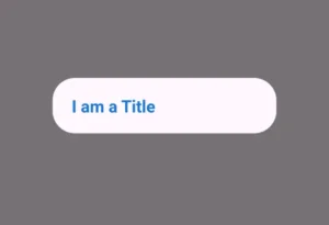
- The title text style parameter of alert dialog is used to decorate the title.
- It takes TextStyle() class.
- For demonstration, I changed its color, size of text and made the text bold. You can play with other parameters of text style as well.
Example 3: content parameter
content: Container(
    padding: EdgeInsets.all(11),
    decoration: BoxDecoration(
    border: Border.all(color: Colors.grey),
    borderRadius: BorderRadius.circular(11)),
    child:
       Text('I am the content. You can pass any widget here'),
                  )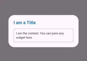
- The content parameter of Flutter alert dialog also takes a Flutter widget.
- For demonstration, I passed it a Flutter container widget.
- I also decorate the container by specifying its border color, border radius, and gave it a child text widget which can be seen in the above image.
Example 4: contentPadding
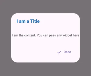
contentPadding: EdgeInsets.symmetric(
                 horizontal: 3,
                 vertical: 41,
                  )
Example 5: actions parameter
 actions: [
    TextButton.icon(
      onPressed: () {
         Navigator.of(context).pop();
                    },
      label: Text('Done'),
         icon: Icon(Icons.done),
              )
          ]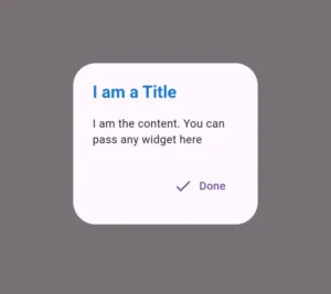
- The actions parameter takes a list of Flutter widgets.
- To explain it practically, I passed it a text button with icon widget. When the users taps it, it’ll close the alert dialog.
Example 6: inSetPadding parameter
insetPadding: EdgeInsets.symmetric(horizontal: 91)

insetPadding: EdgeInsets.symmetric(horizontal: 0)
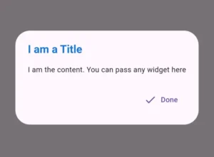
- This parameter is used to set the space between the dialog and the screen edges.
- In the first example, I passed it a horizontal padding and you can see that the dialog width decreases.
- In the second example, I passed it a 0 horizontal padding and the Flutter alertDialog width increases.
- You can play with other methods of EdgeInSets as well like all(), symmetric(), only(), etc.
Example 7: actionsAlignment parameter
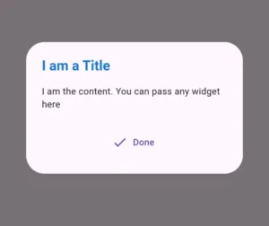
actionsAlignment: MainAxisAlignment.center
actionsAlignment: MainAxisAlignment.start
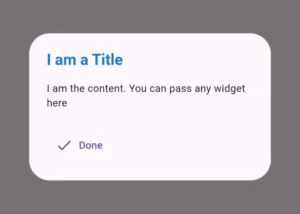
- This parameter is used to set the position of actions widgets. By default, we see them in the end/right position.
- It takes main axis alignment, so in the first example, I passed it the property center and we can see that the widget in actions now shows in center.
- In the second example, I used the start property which positions/aligns the actions widget to the left side of Flutter alert dialog.
You can use multiple widgets in actions and use other properties of MainAxisAlignment as well. Some of these are:
- MainAxisAlignment.spaceAround
- MainAxisAlignment.spaceBetween
- MainAxisAlignment.spaceEvenly
Conclusion
I hope you now have a complete understanding of how to use Flutter AlertDialog properly in your Flutter app. I have discussed its parameters practically with easy code examples and detailed explanations. If you still have any issues, then comment or email me. I’d be happy to help you.
Please don’t forget to visit other posts on this site to understand other amazing Flutter widgets, state management, and more. Thank you.

