Flutter Drawer Widget Explained with Code Examples
Want to show a beautifully animated sidebar to put navigation buttons or other custom Flutter widgets? Then Flutter drawer widget is what you need. Here, we’ll discuss what the drawer widget is, and practically explain its parameters with Flutter code examples.
So, let’s jump right into it.
Overview of Flutter Drawer Widget
It’s a sidebar that typically slides from the left of the screen in mobile apps. We can put navigation options in it like profile, notifications, logout, etc., or any custom items mentioned in the app’s requirements. It makes the Flutter app more beautiful, user-friendly, and easy for users to access various options, as we’re not putting everything on just one screen. In case you want to show an overlay that slides from bottom of screen, then try Flutter bottom sheet.
How does the Drawer work?
When we pass the drawer widget to the Scaffold’s drawer parameter, then by default a menu icon appears in Flutter appbar(when specified). By clicking on that icon, the drawer appears from the left with a beautiful slide animation.
Syntax
Scaffold(
      drawer: Drawer()
    )
Parameters
- Flutter Drawer with Default Icon
- backgroundColor parameter
- child parameter and DrawerHeader() widget
- shadowColor and elevation parameter
- shape parameter
- width parameter
Examples to explain Drawer Parameters
Let’s now implement the drawer and design it by using its parameters.
Example 1: Flutter Drawer with Default Icon
Scaffold(
      appBar: AppBar(),
      drawer: Drawer(),
    )
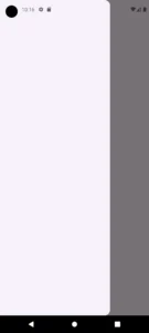
- Here, I just passed a simple drawer widget to the parameter drawer.
- Then to show the default icon of the drawer, I just passed a simple Flutter appbar widget to the parameter appbar.
- We just have to click on that icon and the drawer will slide from the left and display on screen.
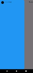
Example 2: backgroundColor parameter
backgroundColor: Colors.blue
Example 3: child parameter and DrawerHeader() widget
child: ListView(
        children: [
          DrawerHeader(
              margin: EdgeInsets.all(11).copyWith(bottom: 31),
              padding: EdgeInsets.all(23),
              decoration: BoxDecoration(
                  color: Colors.blue.withOpacity(.3),
                  borderRadius: BorderRadius.circular(31)
                      .copyWith(topLeft: Radius.circular(0)),
                  border: Border.all(color: Colors.blue)),
              child: Column(
                children: [
                  Text(
                    'Hey There!',
                    style: TextStyle(fontSize: 28, fontWeight: FontWeight.w600),
                  ),
                  Text(
                    'This is the Drawer\'s header',
                    style: TextStyle(
                      fontSize: 14,
                    ),
                  ),
                ],
              )),
          TextButton.icon(
            onPressed: () {},
            label: Text(
              'Notifications',
              style: TextStyle(color: Colors.black.withOpacity(.9)),
            ),
            icon: Icon(
              Icons.notification_add,
              color: Colors.blue.shade700,
            ),
          ),
          TextButton.icon(
            onPressed: () {},
            label: Text(
              'Signout',
              style: TextStyle(color: Colors.black.withOpacity(.9)),
            ),
            icon: Icon(
              Icons.logout,
              color: Colors.blue.shade700,
            ),
          )
        ],
      )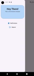
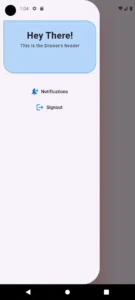
- I passed a ListView() widget to the parameter child which takes a list of Flutter widgets in its children parameter.
- DrawerHeader() can be used to specify a head section of the drawer widget. I have passed it a column widget and inside it some Flutter text widgets to show you how it works. I also customized its parameters and gave it some decoration so it’s easy for you to do the same.
- Then I used 2 Flutter text icon buttons to show notifications and logout options.
- You can pass any widget you want depending on your project’s requirements. So, my suggestion is to try passing other widgets to it as well like Flutter container, elevated button, etc.
Example 4: shadowColor and elevation parameter
shadowColor: Colors.red,
elevation: 50
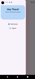
- shadowColor – The shadow color parameter specifies the color that spreads from the drawer. To make it clear, I gave it a red color and you can see a red shadow spreading from the edges of the Flutter drawer.
- elevation – The elevation parameter specifies the extent of how much the shadow will spread or you can say how much the drawer should look elevated or at higher ground. The elevation takes a double(decimal) value and gives it more value will increase elevation so you can play with the values.
Example 5: shape parameter
 shape: RoundedRectangleBorder(
         borderRadius:
           BorderRadius.horizontal(right: Radius.circular(51)))
- BorderRadius.circular()
- BorderRadius.all()
- BorderRadius.only()
- BorderRadius.vertical()
Also, you can use the copyWith() method with them to specific one or more edges differently like BorderRadius.all().copyWith(), so give it a try as well.
Example 6: width parameter
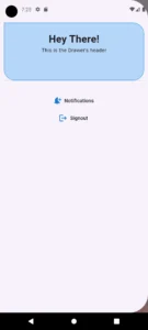
width: MediaQuery.of(context).size.width
width: double.infinity
Conclusion
We’ve discussed the role of the Flutter drawer widget and practically explained its parameters with Flutter code examples. I hope with this knowledge, you’ll be able to easily use the drawer widget in your own Flutter app as well.
But still, if you face any issues with this widget, then do comment or email me. I’d be more than happy to help you. Thank you and please visit my other posts on amazing Flutter widgets, state management, and much more.

