Carousel Slider Flutter Explained
Want to show images or other media with beautiful sliding animation in your Flutter app? Don’t worry, the carousel slider Flutter will solve this problem.
Its main feature is to slide items horizontally or vertically. It can either move automatically or you can control it by swiping – perfect for featuring multiple dashboard views or product highlights, similar to how our free Flutter admin template displays different analytics screens.
We’ll practically understand how to import and use a carousel slider in Flutter. Multiple code examples with screenshots will be used for practical demonstration.
About Carousel Slider Flutter
This slider makes the app’s UI professional and user-friendly. For instance, you can show the highlights of a cricket match on the top in an attractive sliding animation. Besides carousel sliders, Flutter also has built-in Slider and RangeSlider widgets to pick a single value or a range from a specific limit.
Let’s get started with its practical implementation, which includes installation, syntax, and code examples.
Import Carousel Slider in Flutter Project
flutter pub add carousel_slider
In your Flutter project’s terminal, enter this command and press enter. It’ll import this carousel slider package which will be shown in the dependencies section of the pubspec.yaml file as seen below.
dependencies:
  flutter:
    sdk: flutter
  carousel_slider: ^5.0.0
Syntax
CarouselSlider(
      items: [],
      options: CarouselOptions(),
    )
Parameters
- items
- options
Code Examples to use Carousel Slider Flutter
Example 1: ‘items’ parameter
CarouselSlider(
      items: [
        for (int i = 0; i < 5; i++)
          Container(
            height: 100,
            margin: EdgeInsets.all(11),
            alignment: Alignment.center,
            decoration: BoxDecoration(
                color: Colors.blue.shade300,
                borderRadius: BorderRadius.circular(21)),
            child: Text(
              'Item $i',
              style: TextStyle(fontSize: 28, color: Colors.white),
            ),
          )
      ],
      options: CarouselOptions(),
    )
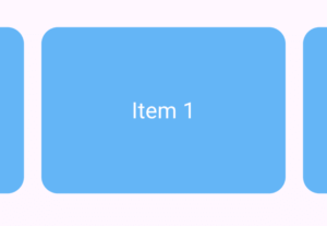
- The parameter ‘items’ takes a list of widgets so I passed it a Flutter container to show you how to items are displayed in the carousel. I’ve given some decoration to the container with Flutter text widget as child.
- You can use a ‘for loop’ to specify the number of items and data in them.
Example 2: ‘options’ parameter
options: CarouselOptions()
Example 2.1: autoPlay
autoPlay: true
Example 2.2: aspectRatio
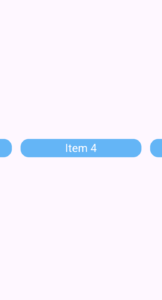
aspectRatio: 6
aspectRatio: 0.6
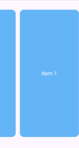
- You can specify the dynamic height of items based on width and vice versa by using the ‘aspectRatio’ parameter. It takes a decimal value but you can pass integer too. By default, its 16/9. It specifies width to height ratio to set the item’s shape. It makes the item’s sizes consistent and not depend on the screen size.
- In the first example, the value 6 means the width is six times the height. Here, the height decreases and the item looks wider.
- In the second example, the value is 0.6 and you can see the height is taller as compared to the item’s width. So it means the greater value will shrink the height and lesser value will increase it.
- If you wrap the carousel with some width having its own height then carousel slider Flutter widget will not increase from its parent’s height.
- Check out information about the aspect ratio class.
Example 2.3: autoPlayCurve
autoPlayCurve: Curves.fastOutSlowIn
- Curves.linear
- Curves.ease
- Curves.easeIn
- Curves.easeOut
- Curves.easeInOut
- Curves.bounceIn
- Curves.bounceOut
- Curves.elasticIn
- Curves.elasticOut
- Easing.emphasizedAccelerate
- Easing.emphasizedDecelerate
- Easing.legacy
Use ‘CTRl+Space‘ with ‘Easing.‘ to explore more.
Example 2.4: autoPlayAnimationDuration
autoPlayAnimationDuration: Duration(seconds: 2)
- This controls the animation duration between the 2 items when they slide or we can say when they do transition.
- It takes the Duration(). The default value is milliseconds: 800. The parameters of Duration take an integer value.
- In the above example, I set it to 2 seconds which means the transition will happen after each 2 seconds.
- It works when the autoPlay is true.
You can use other parameters of Duration as well. See below list:
- days
- hours
- microseconds
- milliseconds
- minutes
Example 2.5: enlargeCenterPage
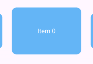
enlargeCenterPage: true
Example 2.6: onPageChanged
 onPageChanged: (index, reason) {
     // action to perform
}- index – It holds the center item index.
- reason – It shows the reason like the user slide it, automatically, or some manual change.
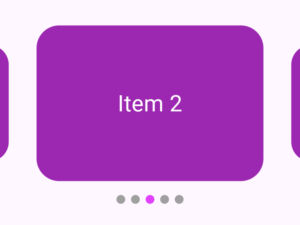
Let’s understand it by implementing carousel slider with indicators. See the below example.
Example 2.6.1: Carousel Slider with Dot Indicators
Step 1
int _currentIndex = 0;
Step 2
final List<Widget> _itemsList = List.generate(
    5,
    (index) => Container(
      margin: const EdgeInsets.all(9),
      alignment: Alignment.center,
      decoration: BoxDecoration(
        color: Colors.purple.shade500,
        borderRadius: BorderRadius.circular(31),
      ),
      child: Text(
        'Item $index',
        style: const TextStyle(fontSize: 31, color: Colors.white),
      ),
    ),
  );
Step 3
Row(
            mainAxisAlignment: MainAxisAlignment.center,
            children: List.generate(
              _itemsList.length,
              (index) => Container(
                width: 12.0,
                height: 12.0,
                margin: const EdgeInsets.symmetric(horizontal: 4.0),
                decoration: BoxDecoration(
                  shape: BoxShape.circle,
                  color: _currentIndex == index
                      ? Colors.purpleAccent
                      : Colors.grey,
                ),
              ),
            ),
          )
Step 4
 onPageChanged: (index, reason) {
                setState(() {
                  _currentIndex = index;
                });
              }
Conclusion
I’ve installed and implemented the carousel slider Flutter with proper code examples and explained them as well for your better understanding. We’ve gone through multiple parameters of carousel slider to customize its behavior.
If you still have any issues with this widget then feel free to ask using email or comment section. I’ll be very happy to help you.
Thank you and please check my other posts for more amazing Flutter widgets.
