Flutter Animations | Implicit vs Explicit | Code Examples
In Flutter animations, we’ll practically explain implicit animations like AnimatedAlign, AnimatedContainer, and AnimatedOpacity with code examples. Then, explain explicit animations, which give you more control using AnimationController and TickerProvider, with examples like FadeTransition and SlideTransition.
Also, we’ll explain other animations with widgets like Hero, AnimatedList, and ScaleTransition. By the end, you’ll know when to go for simple animations or more precise ones, which depends on what you really want.
Outline
Flutter Animations: Implicit vs Explicit
1. Implicit Animations
1.1. AnimatedAlign
1.2. AnimatedContainer
1.3. AnimatedOpacity
1.4. AnimatedCrossFade
2. Explicit Animations
2.1. FadeTransition
2.2. SlideTransition
Other Important Animation Widgets
Hero
AnimatedList
AnimatedBuilder
AnimatedWidget
AnimatedModalBarrier
AnimatedSize
PositionedTransition
ScaleTransition
RotationTransition
DecoratedBoxTransition
SliverFadeTransition
MatrixTransition
RelativePositionedTransition
Conclusion
Flutter Animations: Implicit vs Explicit
In Flutter, animations are simply changes in a widget’s properties, like size, color, or position, that happen over time. These smooth transitions make the app feel more alive and responsive. For example, when something moves or changes color, it looks cool and feels more natural.
Flutter has two main types of animations. These are listed below:
Implicit animations – It is a simple and automatically animate change in properties.
Explicit animations – It gives you more control, allowing you to customize timing and effects.
1. Implicit Animations
Implicit animations are easy to implement and automatically animate changes in widget properties (like size, color, position, etc.) without the need for controllers.
1.1. AnimatedAlign
Animates a child’s alignment within a parent whenever the alignment changes.
class AnimatedAlignExample extends StatefulWidget {
@override
_AnimatedAlignExampleState createState() => _AnimatedAlignExampleState();
}

class _AnimatedAlignExampleState extends State<AnimatedAlignExample> {
bool _isTopLeft = true;

@override
Widget build(BuildContext context) {
return Scaffold(
  appBar: AppBar(title: Text('AnimatedAlign Example')),
  body: Center(
  child: GestureDetector(
  onTap: () {
   setState(() {
    _isTopLeft = !_isTopLeft;
    });
  },
child: AnimatedAlign(
 alignment: _isTopLeft ? Alignment.topLeft : Alignment.bottomRight,
 duration: Duration(seconds: 1),
 curve: Curves.easeInOut,
 child: Container(
 width: 100,
 height: 100,
 color: Colors.blue,
       ),
     ),
    ),
   ),
  );
}
Explanation
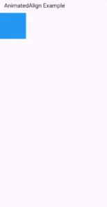
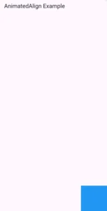
This Flutter example demonstrates how to animate the alignment of a widget using AnimatedAlign. When you tap on the box, it will animate or move to the bottom right, and tapping again will slide it again to the top left. Let’s explain its implementation.
StatefulWidget:
AnimatedAlignExampleis aStatefulWidgetbecause its internal state (_isTopLeft) changes when the user taps the screen.
State Variable:
_isTopLeftis a boolean that determines the alignment of the child Flutter container (eithertopLeftorbottomRight).
UI Layout:
The layout consists of a
Scaffoldwith an Flutter appbar and aCenterwidget containing aGestureDetector.
GestureDetector:
Wraps the
AnimatedAlignso that when the blue box is tapped, it toggles_isTopLeft, triggering a UI update.
AnimatedAlign:
Animates the alignment of its child between two positions:
Alignment.topLeftandAlignment.bottomRight.duration: Duration(seconds: 1)specifies the animation will last for 1 second.curve: Curves.easeInOutapplies a smooth easing animation.
Child Container:
A blue square
Containerwith fixed width and height (100×100) that moves within its parent when tapped.
Animation Trigger:
On tapping the blue box, the
setState()function flips_isTopLeft, causing the alignment to animate accordingly.
1.2. AnimatedContainer
A powerful widget to animate multiple properties (like width, height, color, padding) over time.
bool _selected = false;

Center(
  child: GestureDetector(
    onTap: () {
      setState(() {
     _selected = !_selected;
   });
},
child: AnimatedContainer(
    width: _selected ? 200.0 : 100.0,
    height: _selected ? 100.0 : 200.0,
   color: _selected ? Colors.red : Colors.green,
   alignment: _selected ? Alignment.center : Alignment.topCenter,
   duration: Duration(seconds: 1),
   curve: Curves.fastOutSlowIn,
   child: FlutterLogo(size: 75),
   ),
  ),
)

Explanation
Initially, the container is green, 100×200 in size, and aligned at the top. When tapped, the container changes to red, with a new size (200×100), and the logo aligns to the center. The container smoothly animates between these two states.
Purpose: This Flutter example demonstrates how to animate multiple properties of a container (like size, color, and alignment) over time using
AnimatedContainer.StatefulWidget:
AnimatedContainerExampleis aStatefulWidgetbecause the internal state (_selected) will change when the user interacts with it (taps the container).
State Variable:
_selectedis a Boolean variable that controls the appearance and behavior of the container. When toggled, it triggers an animation.
UI Layout:
The layout consists of a
Scaffoldwith anAppBarand aCenterwidget that contains the interactiveGestureDetector.
GestureDetector:
Wraps the
AnimatedContainerto detect when the container is tapped.When tapped, the
setState()function is called to flip the value of_selected, which causes the container’s properties to animate.
AnimatedContainer:
Properties animated:
width: Changes between 200.0 and 100.0 depending on_selected.height: Changes between 100.0 and 200.0.color: Changes between red and green.alignment: Changes betweencenterandtopCenter.
Animation Duration:
The animation takes 1 second (
Duration(seconds: 1)).
Curve:
Uses
Curves.fastOutSlowInto give the animation a smooth start and end.
Child Widget:
The child of the
AnimatedContaineris aFlutterLogowith a size of 75, which will stay the same throughout the animation but move as the container changes alignment.
1.3. AnimatedOpacity
Fade a widget in or out by animating its opacity.
bool _visible = true;

Column(
          mainAxisAlignment: MainAxisAlignment.center,
          children: [
            AnimatedOpacity(
              opacity: _visible ? 1.0 : 0.0,
              duration: Duration(seconds: 1),
              child: FlutterLogo(size: 100.0),
            ),
            SizedBox(height: 20),
            ElevatedButton(
              onPressed: () => setState(() => _visible = !_visible),
              child: Text('Toggle Opacity'),
            ),
          ],
        )
Explanation
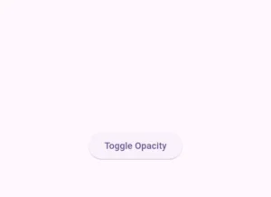
Here we used AnimatedOpacity to create a fade effect. When the button is pressed, the Flutter logo fades in or out smoothly by changing its opacity over 1 second.
StatefulWidget:
The widget is stateful because it needs to track whether the logo should be visible or hidden using the
_visibleboolean shown in the above code.
AnimatedOpacity Widget:
It wraps a
FlutterLogoand changes itsopacitybased on the_visiblevalue.If
_visibleistrue, the logo is fully visible (opacity: 1.0).If
_visibleisfalse, the logo fades out (opacity: 0.0).The transition happens smoothly over 1 second (
duration: Duration(seconds: 1)).
ElevatedButton:
Tapping the button toggles
_visibleusingsetState(), which triggers the opacity animation.
Layout:
A
Columnis used to vertically center the logo and the button on the screen.
1.4. AnimatedCrossFade
Cross-fade between two widgets.
bool _showFirst = true;
Column(
          mainAxisAlignment: MainAxisAlignment.center,
          children: [
            AnimatedCrossFade(
              firstChild: FlutterLogo(size: 100),
              secondChild:
                  Icon(Icons.check_circle, size: 100, color: Colors.green),
              crossFadeState: _showFirst
                  ? CrossFadeState.showFirst
                  : CrossFadeState.showSecond,
              duration: Duration(seconds: 1),
            ),
            SizedBox(height: 20),
            ElevatedButton(
              onPressed: () => setState(() => _showFirst = !_showFirst),
              child: Text('Toggle CrossFade'),
            ),
          ],
        )
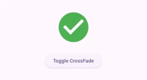
When we tap on the icon, we will see a smooth switch (cross-fade) between two different widgets — a Flutter logo and an icon.
StatefulWidget: Uses a boolean
_showFirstto decide which widget to show.AnimatedCrossFade: It has two child widgets:
firstChild: aFlutterLogo.secondChild: a green check icon (Icons.check_circle).
crossFadeStatecontrols which widget is visible:Shows
firstChildif_showFirstistrue, otherwise showssecondChild.
The transition between the two widgets is animated over 1 second.
ElevatedButton:
We used an elevated button widget and passed it Flutter text widget to its child. Tapping the button toggles
_showFirst, causes the animation to play and switch between the logo and the icon.
2. Explicit Animations
Explicit animations require more setup but give full control using AnimationController, TickerProvider, and animation curves.
2.1. FadeTransition
Use a controller-driven animation to fade in/out.
class FadeTransitionExample extends StatefulWidget {
  @override
  _FadeTransitionExampleState createState() => _FadeTransitionExampleState();
}
class _FadeTransitionExampleState extends State<FadeTransitionExample>
    with SingleTickerProviderStateMixin {

  late AnimationController _controller;
  late Animation<double> _animation;

  @override
  void initState() {
    super.initState();
    _controller = AnimationController(
      duration: Duration(seconds: 2),
      vsync: this,
    );
    _animation = Tween<double>(begin: 0.0, end: 1.0).animate(_controller);
    _controller.forward();
  }
  @override
  void dispose() {
    _controller.dispose();
    super.dispose();
  }

  @override
  Widget build(BuildContext context) {
    return Scaffold(
      appBar: AppBar(title: Text('FadeTransition Example')),
      body: Center(
        child: FadeTransition(
          opacity: _animation,
          child: FlutterLogo(size: 100),
        ),
      ),
    );
  }
}
Explanation
Here, we see a Flutter logo fade in smoothly over 2 seconds when the screen loads, using an AnimationController and FadeTransition.
StatefulWidget with Animation: Uses
SingleTickerProviderStateMixinto control the animation lifecycle.AnimationController:
Controls the timing of the animation.
Set to last 2 seconds and starts immediately with
_controller.forward()ininitState().
Tween Animation:
A
Tween<double>(begin: 0.0, end: 1.0)defines the animation’s range — from fully invisible to fully visible.It animates the opacity value.
FadeTransition Widget:
Takes the animated opacity and applies it to a
FlutterLogo.As the animation plays, the logo gradually fades in.
dispose():
Properly disposes the controller to free up resources when the widget is removed.
2.2. SlideTransition
Slides a widget from one offset to another.
class _SlideTransitionExampleState extends State<SlideTransitionExample>
    with SingleTickerProviderStateMixin {

  late AnimationController _controller;
  late Animation<Offset> _animation;

  @override
  void initState() {
    super.initState();
    _controller = AnimationController(
      duration: Duration(milliseconds: 1000),
      vsync: this,
    );
    _animation = Tween<Offset>(
      begin: Offset(-1.0, 0.0),
      end: Offset.zero,
    ).animate(CurvedAnimation(parent: _controller, curve: Curves.easeInOut));
    _controller.forward();
  }

  @override
  void dispose() {
    _controller.dispose();
    super.dispose();
  }

  @override
  Widget build(BuildContext context) {
    return Scaffold(
      body: Center(
        child: SlideTransition(
          position: _animation,
          child: FlutterLogo(size: 100),
        ),
      ),
    );
  }
}
Explanation
In this code, we’ll see the FlutterLogo smoothly slides in from the left side of the screen over 1 second using SlideTransition and an animated Offset.
AnimationController:
Runs the animation over 1 second (1000 ms).
Starts automatically with
_controller.forward()insideinitState().
Tween<Offset>:
Defines how far the widget moves:
Starts from
Offset(-1.0, 0.0)→ fully off-screen to the left.Ends at
Offset.zero→ back to its original position.
Wrapped in a
CurvedAnimationwithCurves.easeInOutfor a smooth slide.
SlideTransition Widget:
Takes the
positionanimation and moves theFlutterLogobased on it.As the animation plays, the logo slides in from the left to its place in the center.
Other Important Animation Widgets
| Widget | Description |
|---|---|
Hero | Animates shared elements across screens. |
AnimatedList | Animates items added/removed from a list. |
AnimatedBuilder | Used for advanced custom animations. |
AnimatedWidget | Base class for creating custom animated widgets. |
AnimatedModalBarrier | Fades a modal barrier (e.g., backdrop) in/out. |
AnimatedSize | Animates size changes of a child. |
PositionedTransition | Moves a Positioned widget based on an Animation<RelativeRect>. |
ScaleTransition | Animates the scale of a widget. |
RotationTransition | Rotates a widget based on an animation. |
DecoratedBoxTransition | Animates decoration changes (e.g., gradients, borders). |
SliverFadeTransition | Fades slivers in scrollable views. |
MatrixTransition | Animates 3D or transformed widgets using Matrix4. |
RelativePositionedTransition | Positions widgets based on relative bounding boxes. |
Conclusion
Flutter animations are super easy and powerful. If you want quick transitions, use implicit animations. But if you need full control over the animations, explicit ones are the way to go. In this article, we learnt both of them practically with examples.
If you still have any issues, then email us. We’d be happy to help you.