How to use Flutter Table Widget (Code Examples) 2025
To use the Flutter table widget, use the Table() and pass one or more TableRow() to its children list parameter. You can customize it with properties like borders, column widths, text direction, and alignment.
In this practical guide, you’ll learn how to create structured tables with practical examples. By the end, you’ll be able to design clear and professional tables for your Flutter apps.
When to Use the Flutter Table Widget?
- Use it when you need a grid layout with multiple rows and columns.
- Use Row or Column for a single row or column of widgets.
- Use SliverList for a scrollable list with changing content.
- Wrap the table widget inside SingleChildScrollView if the content is too large to fit on the screen to enable scrolling.
Syntax of Table
This widget constructor includes various properties for customizing its behavior.
Table({
 Key? key,
 required List<TableRow> children,
 Map<int, TableColumnWidth>? columnWidths,
 TableColumnWidth defaultColumnWidth = const FlexColumnWidth(),
 TextDirection? textDirection,
 TableBorder? border,
 TableCellVerticalAlignment defaultVerticalAlignment = TableCellVerticalAlignment.top,
 TextBaseline? textBaseline,
})
Explanation
children: Defines the rows of the table usingTableRow, which contains a list of widgets.columnWidths: Specifies width for each column using a map where the key represents the column index and the value is aTableColumnWidthobject.defaultColumnWidth: Sets a default width for unspecified columns.textDirection: Determines whether columns are ordered left-to-right or right-to-left.border: Adds a border to the table usingTableBorder.defaultVerticalAlignment: Sets the default alignment of cells (top,middle,bottom, etc.).textBaseline: Aligns text based on baseline positioning, which is useful for handling different text styles.
Now, let’s understand the parameters of table practically with code examples.
Examples to Understand Flutter Table and its Parameters
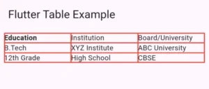
Example 1: Creating a simple Flutter Table
Scaffold(
      appBar: AppBar(
        title: Text("Flutter Table Example"),
      ),
      body: Padding(
        padding: EdgeInsets.all(8.0),
   /////////////// below is where the table code starts
        child: Table(
          border: TableBorder.all(color: Colors.black),
          children: [
            TableRow(
              children: [
                Text("Education",
                    style: TextStyle(fontWeight: FontWeight.bold)),
                Text("Institution"),
                Text("Board/University"),
              ],
            ),
            TableRow(
              children: [
                Text("B.Tech"),
                Text("XYZ Institute"),
                Text("ABC University"),
              ],
            ),
            TableRow(
              children: [
                Text("12th Grade"),
                Text("High School"),
                Text("CBSE"),
              ],
            ),
          ],
        ),
      ),
    );
In this example, we are using the table to show educational details.
First we used the Table(), and in its children parameter we passed a list of children to it.
We added a border around the table by using
TableBorder.all(color: Colors.black)which makes it look neat.Each row in the table is created using TableRow. Inside a row, we place widgets (in this case, Text widgets) to show the actual data.
- Each text inside the table is a Text widget.
- The header text is made bold
TextStyle(fontWeight: FontWeight.bold)so it looks different.
Example 2: border parameter
border: TableBorder.all(width: 2, color: Colors.red)
The border property in the Table widget is used to add borders around the table and its cells. In this example:
TableBorder.all→ Applies a border to all sides of the table and its cells.width: 2→ Sets the border thickness to 2 pixels.color: Colors.red→ Makes the border color red.- Effect → Each cell in the table will have a 2-pixel red border, making it clearly visible and structured.
Example 3: columnWidths parameter
By default, Flutter gives all columns equal width using FlexColumnWidth(). However, you can control the width manually using FixedColumnWidth().
 columnWidths: {
            0: FixedColumnWidth(100),
            1: FlexColumnWidth(),
          }
- Column 0 (first column) → Always 100 pixels wide.
- Column 1 (second column) → Takes the remaining available space.
You can use it when you need precise column sizes instead of equal distribution.
Example 4: textDirection parameter
textDirection: TextDirection.rtl

By default, Flutter displays text from left to right (LTR). If you need to show text from right to left (RTL), you can set textDirection: TextDirection.rtl.
Example 5: defaultVerticalAlignment parameter
By default, table cells align at the top of their row. You can change this alignment using the defaultVerticalAlignment parameter.
defaultVerticalAlignment: TableCellVerticalAlignment.middle
- All cells in the table will follow the selected vertical alignment.
- Useful when you need content to be centered or aligned differently within rows.
Vertical Alignment Options:
TableCellVerticalAlignment.top→ Aligns content to the top (default).TableCellVerticalAlignment.middle→ Centers content vertically.TableCellVerticalAlignment.bottom→ Aligns content to the bottom.
Example 6: TableRow and its Parameters
TableRow(
  decoration: BoxDecoration(
    color: Colors.blue[100], // Background color for the row
    border: Border(
    bottom: BorderSide(color: Colors.black, width: 1), // Bottom border for row
  ),
),
children: [
 Padding(
  padding: EdgeInsets.all(8.0), // Adds space inside the cell
  child: Text(
    "Education",
    style: TextStyle(fontWeight: FontWeight.bold),
  ),
),
Padding(
  padding: EdgeInsets.all(8.0),
  child: Text("Institution"),
 ),
Padding(
  padding: EdgeInsets.all(8.0),
  child: Text("Board/University"),
  ),
 ],
)
Explanation of TableRow Parameters:
| Parameter | Description |
|---|---|
children | A list of widgets representing each column in the row. |
decoration | Adds background color, borders, or gradients to the row. |
border | Customizes borders for individual rows (e.g., bottom border). |
Conclusion
The Flutter table widget helps create structured layouts with rows and columns. It is useful for displaying data, schedules, and forms. Here, we learned important properties include TableRow for rows, Text for content, TableBorder.all for adding borders, etc.
You can set column widths using FixedColumnWidth, change text direction with TextDirection.rtl, and adjust vertical alignment using defaultVerticalAlignment. These features make it easy to design clear and user-friendly tables in Flutter apps.
If you still have any issues, then email us. We’d be happy to help you. Also, don’t forget to visit our other posts for more in-depth information on other Flutter widgets and more.