How to Customize Flutter Appbar Widget

Definition of Flutter appbar widget, its usage, importance in a Flutter app, syntax of appbar will be explained. Its constructors will be explained practically with 14 proper and easy code examples.

What is Flutter Appbar Widget?

Flutter appbar is a bar that can be shown in the top position of Flutter app. We can put drawer icons, back icons, title, other action buttons like logout, menu and many more. It makes the Flutter app very attractive and allows the users to use app with ease.

Syntax of appbar in Flutter

Scaffold(
      appBar: AppBar()
    )
The scaffold has an appBar constructor and we can pass an AppBar widget to it. We won’t see any appbar on the screen but it’s there on the top. The color of appbar is transparent so its actually invisible to us.

Constructors of Flutter Appbar

The list is:

  • background color
  • title
  • center title
  • title spacing
  • title text style
  • actions
  • actions icon theme
  • leading
  • automatically imply leading
  • leading width
  • elevation and shadow color
  • flexible space
  • toolbar height
  • bottom
  • bottomOpacity

Example 1: background color of app bar

backgroundColor: Colors.green
appbar background color
We used the background color constructor and passed it the green color to change its color. You can pass any color of your choice to it. You can pass the color code as well like Color(0xff939393) or give shade like this Colors.green.shade700. You can play with the opacity of color as well like this Colors.green.withOpacity(.8).

Example 2: title of appbar

title: Text('Appbar Title')
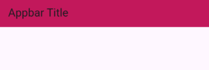
flutter appbar title
This title constructor takes a Flutter widget so in our case, we passed it a Flutter text widget. By default, it’ll show on the left of appbar.

Example 3: center title

centerTitle: true
flutter appbar widget center title

This constructor takes a boolean value. It’s role is to place the title in the center of appbar. By default, its false, so making it true placed the title in center as shown in the above image.

Example 4: title spacing from left

titleSpacing: 0
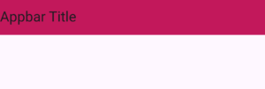
title spacing
titleSpacing: 41

title spacing appbar

If you want to specify the space between the title and the left side/edge of it then use the title spacing constructor. It takes a double value but you can pass integer as well.
In the first example, we passed it 0 which removes the spaces between the title from the left.
In the second example, we gave a value of 41 and you can see some space now.

Example 5: title text style

titleTextStyle: TextStyle(
           color: Colors.white,
           fontSize: 19,
           fontWeight: FontWeight.bold)
title textstyle
This constructor is used to give the text of title some styling. It takes a text style widget so we changed the color, font size and font weight of the title text as seen in the image.
If you have given the style using the text widget style parameter passed to the title, then that specific style properties will be used and not the properties we specified in the title text style parameter.

Example 6: actions constructor

actions: [ 
   Icon(Icons.logout),
   IconButton(onPressed: () {},
         icon: Icon(Icons.person),),
        ],
appbar actions constructor
The actions constructor takes a list of Flutter widgets. It’s shown in the right side of appbar. In our case, we’ve give it a simple icon and an icon button. You can pass it any other widget as well.

Example 7: actions icon theme

actionsIconTheme: IconThemeData(color: Colors.white,size: 21,)
actions icon theme
This action icon theme constructor is used to style the list of icons passed to the actions constructor. In our case, we just changed the color and size of icons. You can see that both the simple icon and icon button widget style has been changed.
You can also change the style of these icons in the icon widgets directly that are passed to the actions. Just use the constructors of icon or icon button widget here because we have only used these 2 in our case.

Example 8: leading constructor

leading: TextButton(
          onPressed: (){
          Navigator.of(context).pop();
        },
        child: Text('Back'))
appbar leading text
The leading constructor takes a widget and its shown in the left side of appbar. We passed a text widget to it, you can pass icon or any other widget like Flutter dropdown widget, text widget, etc. In our case, we used the pop navigator and when the user clicks on it then the app will go one screen back. Don’t worry, we’ll discuss this navigation in the next section.

Example 9: automatically imply leading

If you don’t specify any leading, then when you navigate from one screen to another screen then the second screen appbar will show a back arrow in the leading position. Clicking on it will pop the screen to the previous screen.
leading appbar
In the above image, you can see a back arrow. We navigated from one screen to another and the second screen showed it.
automaticallyImplyLeading: false
But when we pass false to the automatically imply leading then the second screen won’t show that back arrow even if being navigated to. By default, the Boolean value it takes is true.
Keep in mind that if you specify the leading parameter and then even if the automatically imply leading is false, still it will show the leading. So, make sure to not specify it if you don’t want to show the leading or modify it logically so you can remove it if your requirements demands it.

Example 10: leading width

leadingWidth: 120
leading width of appbar
This constructor is used to change the width of the leading. This takes a double value but you can pass integer as well. I have passed it a value of 120 to explain practically.
Here I have used a container with some color to show you the real width of leading that has been customized using the leading width parameter.

Example 11: elevation and shadow color

elevation: 5,
shadowColor: Colors.black
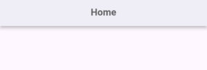
app bar elevation
  • The elevation gives the appbar a shadow effect so it looks elevated from the screen. With it we have to set some color to the shadowColor constructor as well or else we won’t see any shadow.
  • The elevation takes a double but you can pass integer as well and the shadow color takes a color.
  • You can pass the color code as well as I have explained in the appbar background color section of this article.
  • The more elevation value, the more shadow it will spread. You can play by modifying the values until you reached your desired design.

Example 12: flexible space

flexibleSpace: Container(
            color: Colors.pink.shade700,
            child: Column(
              mainAxisAlignment: MainAxisAlignment.center,
              children: [
                Text(
                  'Home',
                ),
                Row(
                  mainAxisAlignment: MainAxisAlignment.spaceEvenly,
                  children: [
                    Text(
                      'Home again 1',
                    ),
                    Text(
                      'Home again2',
                    ),
                  ],
                ),
              ],
            ),
          ),
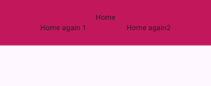
appbar widget flexible space
This flexible space constructor can take the whole appbar space and it takes a Flutter widget. You can try it with other widgets as well but for this example, we passed a Flutter container and some rows and columns to show some Text widgets as a sample to make you understand.
In case, you are worried how come the height of app bar is less and the content is more. To fix this problem, see the below section.

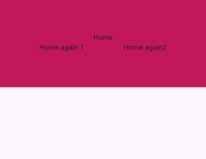
Example 13: toolbar height

toolbarHeight: 180
toolbar height
You can give your appbar a custom height using the toolbar height constructor. It takes a double value but you can pass an integer as well. For the sake of example, I have passed a greater value to this constructor and you can see that the appbar height is now larger.

Example 14: bottom constructor for Flutter Appbar tabs

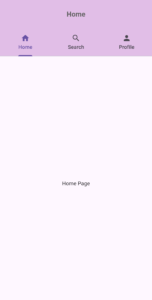
Sometimes we need to use tabs in the appbar to navigate/shift to screens. For that, we use the bottom constructor.

It shows the item at the bottom of Flutter appbar. Actually, we can use it to show tabbar. See below code:

DefaultTabController(
        length: 3,
        initialIndex: 0,

        child: Scaffold(
          appBar: AppBar(

            bottom: TabBar(
              tabs: [
                Tab(icon: Icon(Icons.home), text: 'Home'),
                Tab(icon: Icon(Icons.search), text: 'Search'),
                Tab(icon: Icon(Icons.person), text: 'Profile'),
              ],
            ),

            centerTitle: true,
            backgroundColor: Colors.purple.shade100,
            toolbarHeight: 80,
            title: Text(
              'Home',
              style: TextStyle(
                  color: Colors.grey.shade700,
                  fontSize: 19,
                  fontWeight: FontWeight.bold),
            ),
          ),

          body: TabBarView(
            children: [
              Center(child: Text('Home Page')),
              Center(child: Text('Search Page')),
              Center(child: Text('Profile Page')),
            ],
          ),
        ),
      ),
appbar bottom tabs
  1. First I wrapped our scaffold widget with default tab controller and assigns the number to 3. You can specify 4 or more/less as well but make sure that the number of tabs matches everywhere.
  2. Then I passed the tab bar widget to the bottom constructor. By passing a list of tabs to the tabs constructor, I specified tabs in our Flutter appbar widget.
  3. In body, I passed the tab bar view widget to show the screens depending on the selected tab. It’s order-sensitive so the first item will be assigned to the first tab, the second child to the second tab, and so on. You can pass any widgets you want to the list passed to the tab bar view but make sure that the numbers of tab bar view and tab view items are same.
  4. In our later article, I will explain the bottom and tabs of appbar widget in more detail.

Example 15: bottomOpacity of Flutter Appbar

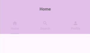
bottomOpacity: 0.4
flutter appbar bottom Opacity
  1. The bottomOpacity parameter of Flutter appbar is used to decide how much visible the bottom of appbar should be.
  2. It’s default value is 1.0. It takes a double value from 0 to 1. The lesser the value is from 1 the less visible the bottom will be.
  3. To demonstrate it, we passed it a value 0.4 and you can see that the bottom tabs are less visible now. If you pass it 0 then they won’t be visible but still if you tap on them then they will change tabs as before.
  4. It means the bottomOpacity of appbar just modify the visibility of the appbar bottom.

Conclusion

I hope you now have a detailed understanding of how to properly customize and use Flutter appbar widget. Do comment if you have any problems/queries with appbar widget, I will be happy to solve them.

Thank you.

Leave a Comment

Your email address will not be published. Required fields are marked *