How to use Flutter Bottom Navigation Bar
I love to make my Flutter app easy to navigate for better user experience and less taps. That’s one of the reason I’ve to use Flutter bottom navigation bar widget.
By using this widget, now I can easily switch between different Flutter screens.
Let’s understand importance of this bottom navigator bar Flutter and how to add it in our app. Also, I’ll explain its parameters with code examples and proper explanation so you can properly customize this widget in your own Flutter app as well.
About Flutter Bottom Navigation Bar Widget
We now know that we can use this bottom navigator to move between screens efficiently. It’ll not only save’s user time but also make the user’s experience good.
This widget typically appears in the bottom of the Flutter app. It can take multiple items and these are connected to different screens(or you can say Flutter widgets). By tapping on any of these items, the screen associated with it will appear instantly.
Importance of Bottom Navigation (Simple theoretical Example)
For instance, you have a chat app in which there are some specific screens. These are:
- Home
- Chat
- Notifications
- User Profile
- Settings
Wrong Approach
The non professional approach for that would be to make one main screen and put buttons on it for these above specified screens. Now user have to move to the screen then come back again to open the other screen and so on. This is not very user friendly.
Right Approach(Using Bottom Navigator)
Here, we’ll list items and attach the above screens to them. Now user can easily open the screens and the bottom nav will still be visible for the user to switch to other screen without moving back.
We’ll understand this theory practically with code example as well.
Syntax
Scaffold(
  bottomNavigationBar: BottomNavigationBar(
        items: [  //list of bottom navigation bar items  ]
            ),
    )
- The Flutter scaffold has a parameter named bottomNavigationBar which takes a Flutter widget.
- We can pass our bottom navigation bar widget to it.
- The Flutter bottom navigation items parameter takes a list of bottom navigation bar item class and its required.
Parameters
Parameters of this navigation widget is listed below:
- items
- type(explained in items parameter example 1.1)
- currentIndex
- onTap
- backgroundColor
- elevation
- iconSize
Let’s understand them with practical Flutter code examples.
Examples to explain Flutter Bottom Navigator Bar Widget
Example 1: items parameter
BottomNavigationBar(
   items: [
      BottomNavigationBarItem(label: 'home', icon: Icon(Icons.home)),
      BottomNavigationBarItem(label: 'profile', icon: Icon(Icons.person))
      ])

The parameter items takes a list of only BottomNavigationBarItem class. For demonstration, we only gave it 2 items and the minimum range is 2 as well. You can give it more depending on your requirements.
Example 1.1: BottomNavigationBarItem Class parameters and the ‘type’ parameter of BottomNavigatorBar Widget
BottomNavigationBarItem(
       label: 'home',
       icon: Icon(Icons.home),
       activeIcon: Icon(Icons.home_outlined),
       tooltip: 'This is home',
       backgroundColor: Colors.red)
Image 1
Image 2
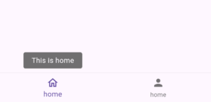
Image 3
- label – This parameter takes a string and its used to show a label text unde the icon of bottom navigation item.
- icon – This takes a Flutter widget so I passed it a simple Flutter icon widget. You can decorate this icon by its size, color etc. or try it with other widgets as well.
- activeIcon – This parameter also takes a Flutter widget and can be used to show a specific widget when that item is selected as seen in the 1st image. For demonstration, I gave it an outline home icon.
- toolTip – The tool tip paramater takes a simple string. It can be used to guide the user about the role of this item. Just long press on it and it’ll show the text specified. See it in the 2nd image.
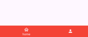
- backgroundColor – It takes a color so we gave it red. When the item is selected, background color is set and the type parameter of bottom navigation bar is set to shifting like this, type: BottomNavigationBarType.shifting, then the selected item background color will be shown in the bottom nav bar. Other items icon will be visible but not their labels. Use this to give a good color changing effect. Make sure the type is shifting if you want the color to cover the bottom bar as shown in the 3rd image.
Example 2: currentIndex parameter
currentIndex: index
int index = 0;
As you can see above, that I created an integer variable of value 0(you can give other value too) and pass it to the current index parameter. In the next example, we’ll see how it’ll select the tapped item.
Example 3: onTap parameter
 onTap: (value) {
     setState(() {
         index = value;
              });}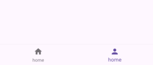
- The onTap parameter of bottom navigation bar takes a function of a single parameter(its type is integer) in which the current index is stored when the item is tapped.
- I have assigned value of that parameter to the integer variable and pass that integer to the currentIndex parameter of bottom navigation bar.
- I have used the stateful widget of Flutter because I have to rebuild the UI using Flutter setState so the change in focused bottom nav bar item is seen. You can do it with state management too like riverpod, etc. It totally depends on the requirements of your Flutter project.
- For demonstration, I tapped on the second item and in the above image, we can see that its now focused.
Example 4: backgroundColor parameter of bottom navigation bar Flutter
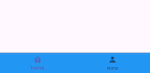
backgroundColor: Colors.blue
- Colors.blue.shade200
- Color(0xff758585)
- Colors.blue.withOpacity(0.2)
- Colors.blue[200]
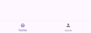
Example 5: elevation parameter
elevation: 0
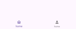
elevation: 10
Example 6: iconSize parameter
iconSize: 30
Example 7: Chat App screens navigation using Flutter Bottom Navigation
As I’ve promised that I’ll give a code example on different screens of chat app whose navigation will be controlled by navigation bottom bar Flutter. See below:
Step 1
int index = 0;

  List chatBottomNavIcons = [
    {'title': 'Home', 'icon': Icons.home, 'bColor': Colors.red},
    {'title': 'Chat', 'icon': Icons.chat, 'bColor': Colors.blue},
    {'title': 'Profile', 'icon': Icons.person, 'bColor': Colors.grey},
    {'title': 'Settings', 'icon': Icons.settings, 'bColor': Colors.purple},
];Step 2
bottomNavigationBar: BottomNavigationBar(
          currentIndex: index,

          type: BottomNavigationBarType.shifting,

          onTap: (value) {
            setState(() {
              index = value;
            });
          },

          items: [
            for (int i = 0; i < chatBottomNavIcons.length; i++)
              BottomNavigationBarItem(
                label: chatBottomNavIcons[i]['title'],
                backgroundColor: chatBottomNavIcons[i]['bColor'],
                icon: Icon(
                  chatBottomNavIcons[i]['icon'],
                ),
              ),
])Step 3
class NewScreen extends StatelessWidget {

  final String name;
  const NewScreen({super.key, required this.name});

  @override
  Widget build(BuildContext context) {
    return Center(
      child: Text(
        name,
        style: TextStyle(fontSize: 21, fontWeight: FontWeight.w500),
      ),
    );
  }
}Step 4
Scaffold(
      body: NewScreen(
        name: chatBottomNavIcons[index]['title'],
      ),
// bottom navigation bar code specified here
)
Step 5 (Testing)
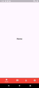
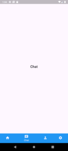
We can see that the color of bottom nav bar and the screen content is changing which means the bottom navigation is working perfect.
This was a simple example, I want you to try it yourself so you can understand it better.
Conclusion
We’ve learned how Flutter bottom navigation bar widget can be implemented in a Flutter app and how to properly customize its parameters with easy and detailed code examples. Do share if you still face any issues related to the bottom navigation bar Flutter. I’ll be very pleased to help you.
Thank you and don’t forget to visit my other informative posts on other Flutter widgets as well.

