Flutter GridView Widget | Extent, Count, Builder, Custom
Let’s explore Flutter GridView widget for creating scrollable grid layouts in apps.
We’ll cover four main methods of grid view widget and their parameters with easy code examples and proper explanations. These are GridView.extent(), GridView.count(), GridView.builder(), and GridView.custom().
After reading this post, you’ll know how to build responsive, interactive grids in your own Flutter apps as well.
What is Flutter GridView Widget?
In Flutter, a GridView is actually a widget that displays items in a scrollable grid layout that is similar to a table with rows and columns. It’s perfect for creating responsive UIs like photo galleries, app launchers, and card lists.
This widget lets you scroll both up and down or left and right. You can put anything inside each box, like text, pictures, or icons. So, if you’re making a gallery or app menu, GridView makes that super simple.
It’s like having a scrollable board where every item fits in its own place. Really helpful when you want things to look neat and easy to click or tap.
Methods of GridView
Flutter offers multiple ways to implement a GridView, depending on your needs:
GridView.extent()GridView.count()GridView.builder()GridView.custom()
Syntax (General Structure of Flutter Grid View)
GridView(
        gridDelegate: SliverGridDelegateWithFixedCrossAxisCount(
          crossAxisCount: 2,
        ),
        children: <Widget>[
          // You can add your Flutter widgets here
        ],
      )
GridViewhelps you display items in a grid, meaning rows and columns.The
gridDelegateproperty controls how the grid looks.SliverGridDelegateWithFixedCrossAxisCount: This one creates a grid with a set number of columns.crossAxisCount: 2: This tells the grid to have 2 columns. You can change this number based on how many columns you want.
Code Examples to Explain the GridView Methods
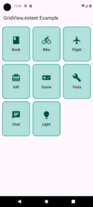
1. GridView.extent()
Use it when you want a flexible column count based on the maximum width of each tile.
Code Example
class GridViewExtentExample extends StatelessWidget {
  const GridViewExtentExample({super.key});
  @override

  Widget build(BuildContext context) {
    return Scaffold(
      appBar: AppBar(title: const Text("GridView.extent Example")),
      body: GridView.extent(
        key: const PageStorageKey<String>('grid_extent'),
        scrollDirection: Axis.vertical,
        reverse: false,
        controller: ScrollController(),
        primary: false,
        physics: const BouncingScrollPhysics(),
        shrinkWrap: true,
        padding: const EdgeInsets.all(10),
        maxCrossAxisExtent: 150,
        mainAxisSpacing: 12.0,
        crossAxisSpacing: 12.0,
        childAspectRatio: 0.8,
        addAutomaticKeepAlives: false,
        addRepaintBoundaries: true,
        addSemanticIndexes: true,
        cacheExtent: 500.0,
        children: List.generate(customItems.length, (index) {
          return Container(
            decoration: BoxDecoration(
              color: Colors.teal.shade100,
              borderRadius: BorderRadius.circular(15),
              border: Border.all(color: Colors.teal, width: 2),
            ),
            child: Column(
              mainAxisAlignment: MainAxisAlignment.center,
              children: [
                Icon(
                  customItems[index].icon,
                  size: 40,
                  color: Colors.teal.shade900,
                ),
                const SizedBox(height: 10),
                Text(
                  customItems[index].title,
                  textAlign: TextAlign.center,
                  style: const TextStyle(
                    fontSize: 16,
                    fontWeight: FontWeight.w500,
                  ),
                ),
              ],
            ),
          );
        }),
        semanticChildCount: customItems.length,
        dragStartBehavior: DragStartBehavior.down,
        keyboardDismissBehavior: ScrollViewKeyboardDismissBehavior.onDrag,
        restorationId: 'gridview_extent_id',
        clipBehavior: Clip.antiAlias,
        hitTestBehavior: HitTestBehavior.deferToChild,
      ),
    );
  }
}
class CustomItem {
  final String title;
  final IconData icon;
  const CustomItem({required this.title, required this.icon});
}

const List<CustomItem> customItems = [
  CustomItem(title: 'Book', icon: Icons.book),
  CustomItem(title: 'Bike', icon: Icons.directions_bike),
  CustomItem(title: 'Flight', icon: Icons.flight),
  CustomItem(title: 'Gift', icon: Icons.card_giftcard),
  CustomItem(title: 'Game', icon: Icons.videogame_asset),
  CustomItem(title: 'Tools', icon: Icons.build),
  CustomItem(title: 'Chat', icon: Icons.chat),
  CustomItem(title: 'Light', icon: Icons.lightbulb),
];
Explanation
key:
Used to preserve the scroll position with a unique identifier. PageStorageKey(‘grid_extent’) allows the grid to retain scroll state when switching tabs/screens.scrollDirection:
Sets the scroll direction of the grid. Axis.vertical scrolls up and down.reverse:
Reverses the scroll direction when set to true. false means normal scroll direction.controller:
Provides a ScrollController to programmatically control the scroll behavior.primary:
When false, the grid doesn’t use the PrimaryScrollController. Its useful when inside another scroll view.physics:
Controls how scrolling behaves. BouncingScrollPhysics() adds a bounce effect like iOS scrolls.shrinkWrap:
When set to true, the grid takes only the space it needs. Its helpful inside Column or ListView.padding:
Adds space around the grid content. EdgeInsets.all(10) adds 10 pixels of padding on all sides.maxCrossAxisExtent:
Sets the maximum width each tile can take. 150 means as many tiles will fit in a row as possible, each being at most 150 pixels wide.mainAxisSpacing:
Adds space between rows (vertically). 12.0 pixels between each row.crossAxisSpacing:
Adds space between columns (horizontally). 12.0 pixels between each column.childAspectRatio:
Defines the width/height ratio of each tile. 0.8 makes tiles taller than they are wide.addAutomaticKeepAlives:
Controls whether each child’s state is automatically retained. false disables that feature.addRepaintBoundaries:
Boosts performance by creating separate repaint areas for children. true improves rendering efficiency.addSemanticIndexes:
Enables accessibility index annotations for screen readers. true helps assistive technologies.cacheExtent:
Defines how much content outside the visible area should be cached. 500.0 improves smooth scrolling by preloading extra content.children:
A list of widgets displayed in the grid. In this case, List.generate(…) dynamically creates tiles based on a data list. We returned Flutter container with custom decoration and it will show titles using Flutter text widget and icons.semanticChildCount:
Provides the count of children to screen readers. Set to customItems.length for accurate accessibility.dragStartBehavior:
Determines when a drag gesture starts. DragStartBehavior.down triggers it as soon as the user touches down.keyboardDismissBehavior:
Defines how the keyboard dismisses during scrolls. onDrag hides the keyboard when the user scrolls.restorationId:
A unique ID for restoring the scroll position during app lifecycle events.clipBehavior:
It controls how child widgets are clipped. Clip.antiAlias smooths edges for better visuals.hitTestBehavior:
This parameter determines how touch events are passed. deferToChild means children handle the taps.
2. GridView.count()
This method can be used when you already know the number of columns to display and want a fixed layout.
Code Example
class GridViewCodeExample extends StatelessWidget {
  const GridViewCodeExample({super.key});
  @override
  Widget build(BuildContext context) {
    return Scaffold(
      appBar: AppBar(title: const Text("GridView Code Example")),
      body: GridView.count(
        crossAxisCount: 3,
        crossAxisSpacing: 4.0,
        mainAxisSpacing: 8.0,
        padding: const EdgeInsets.all(8.0),
        childAspectRatio: 1.0,
        shrinkWrap: true,
        physics:
            const BouncingScrollPhysics(),
        children: List.generate(choices.length, (index) {
          return Center(
            child: Card(
              elevation: 5,
              shape: RoundedRectangleBorder(
                borderRadius: BorderRadius.circular(10), // Round corners
              ),
              child: Center(
                child: Text(
                  choices[index]
                      .title, // Displaying the choice title in each grid tile
                  style: const TextStyle(fontSize: 18),
                  textAlign: TextAlign.center,
                ),
              ),
            ),
          );
        }),
      ),
    );
  }
}

class Choice {
  const Choice({required this.title});
  final String title;
}

const List<Choice> choices = <Choice>[
  Choice(title: 'Home'),
  Choice(title: 'Contact'),
  Choice(title: 'Map'),
  Choice(title: 'Phone'),
  Choice(title: 'Camera'),
  Choice(title: 'Setting'),
  Choice(title: 'Album'),
  Choice(title: 'WiFi'),
];
Explanation
crossAxisCount:
Specifies the number of columns you want in the grid.
Example:
crossAxisCount: 3means the grid will have 3 columns.
crossAxisSpacing:
Defines the space between each column in the grid.
Example:
crossAxisSpacing: 4.0adds a 4.0-pixel gap between columns.
mainAxisSpacing:
Defines the space between each row in the grid.
Example:
mainAxisSpacing: 8.0adds an 8.0-pixel gap between rows.
padding:
Adds padding around the entire grid (inside the container).
Example:
padding: const EdgeInsets.all(8.0)adds 8.0 pixels of padding on all sides.
childAspectRatio:
Specifies the aspect ratio of each child in the grid.
It’s calculated as
width / height.Example:
childAspectRatio: 1.0makes the width and height of each grid item equal, resulting in square tiles.
shrinkWrap:
Shrinks the grid to the size of its children, meaning it won’t take up more space than required.
Example:
shrinkWrap: truemakes the grid’s height adjust to the content’s height.
physics:
Determines the scroll behaviour.
Example:
physics: const BouncingScrollPhysics()adds a bouncing effect when the grid is scrolled.
children:
This parameter takes a list of widgets that will be displayed inside each grid cell.
You can use
List.generateto dynamically create widgets like text, icons, or images in each grid tile.
Displaying Data in a Card:
Data, like titles, is passed to the Flutter Card widget, usually wrapped in a Text widget. This text is centred and styled as needed. For example, child: Center(child: Text(choices[index].title)) displays each item’s title inside its card.
Using a List to Populate Cards:
A list, like choices, holds several data items. List.generate creates a card for each item, showing different data from the list based on its position (index). So, List.generate(choices.length, (index) { return Card(…) }) creates a card for each choice.
- Other Parameters:
- It also has other parameters which we want you to implement as shown in the first example.
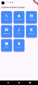
3. GridView.builder()
We can use it when you need to display a large or infinite number of items dynamically.
Code Example
class GridViewBuilderExample extends StatelessWidget {
  const GridViewBuilderExample({super.key});
  @override
  Widget build(BuildContext context) {
    return Scaffold(
      appBar: AppBar(title: const Text("GridView Builder Example")),
      body: GridView.builder(
        gridDelegate: SliverGridDelegateWithFixedCrossAxisCount(
          crossAxisCount: 3, // 3 columns
          crossAxisSpacing: 8.0, // Space between columns
          mainAxisSpacing: 10.0, // Space between rows
          childAspectRatio: .9, // Adjust aspect ratio for better fit
        ),
        padding: const EdgeInsets.all(8.0),
        itemCount: items.length, // Number of items in the grid
        shrinkWrap: true,
        physics: const BouncingScrollPhysics(),
        itemBuilder: (context, index) {
          return Card(
            elevation: 8, // Shadow for a raised effect
            shape: RoundedRectangleBorder(
              borderRadius: BorderRadius.circular(15), // Rounded corners
            ),
            color: Colors.blueAccent, // Background color
            child: Center(
              child: Column(
                mainAxisAlignment: MainAxisAlignment.center,
                children: <Widget>[
                  Icon(
                    items[index].icon, // Displaying icon from the list
                    size: 40.0,
                    color: Colors.white,
                  ),
                  const SizedBox(height: 8),
                  Text(
                    items[index].title, // Displaying the title
                    style: const TextStyle(
                      fontSize: 16,
                      color: Colors.white,
                      fontWeight: FontWeight.w300,
                    ),
                    textAlign: TextAlign.center,
                  ),
                ],
              ),
            ),
          );
        },
      ),
    );
  }
}

class Item {
  const Item({required this.title, required this.icon});
  final String title;
  final IconData icon;
}

// New list with different values and icons
const List<Item> items = <Item>[
  Item(title: 'Search', icon: Icons.search),
  Item(title: 'Notifications', icon: Icons.notifications),
  Item(title: 'Profile', icon: Icons.account_circle),
  Item(title: 'Messages', icon: Icons.message),
  Item(title: 'Music', icon: Icons.music_note),
  Item(title: 'Shopping', icon: Icons.shopping_cart),
  Item(title: 'Gallery', icon: Icons.photo),
  Item(title: 'Location', icon: Icons.location_on),
];
Explanation
gridDelegate:
This parameter takes a SliverGridDelegate type. In this case, it’s aSliverGridDelegateWithFixedCrossAxisCount:
SliverGridDelegateWithFixedCrossAxisCount: A delegate that arranges the grid items in a fixed number of columns.
crossAxisCount (int): Specifies the number of columns in the grid (e.g., 3).
crossAxisSpacing (double): The space between columns in pixels (e.g., 8.0).
mainAxisSpacing (double): The space between rows in pixels (e.g., 10.0).
childAspectRatio (double): The aspect ratio of each grid item. Values less than 1 will make items taller, while values greater than 1 will make items wider (e.g., 0.9).
padding (EdgeInsets):
Sets the padding around the entire grid. Takes a value of type EdgeInsets, such as adding padding of EdgeInsets.all(8.0) pixels on all sides.
itemCount (int):
Specifies the number of items in the grid, based on the list length (items.length), e.g., items.length.
shrinkWrap (bool):
Determines whether the grid should take up only as much space as needed. It takes a boolean value (true or false), e.g., true.
physics (ScrollPhysics):
Defines the scroll behaviour. It accepts a ScrollPhysics type, like BouncingScrollPhysics(), which gives the grid a natural bounce effect when scrolling.
itemBuilder (IndexedWidgetBuilder):
This is a callback function that takes two parameters:
context (BuildContext): The context in which the widget is built.
index (int): The index of the current item being displayed.
Inside this function, a Card widget is created for each grid item.
- card:
- Here we displayed each item inside a Card widget with a raised effect (elevation), rounded corners (shape), and a blue background colour, containing an icon and text (title), ensuring a visually appealing design for each grid item.
- Other Parameters:
- You can try other parameters of this too like shown in example 1(GridView.extent()).
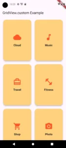
4. GridView.custom()
It lets you build a scrollable grid in Flutter app with full control over layout, item creation, and performance. It uses SliverChildBuilderDelegate and SliverGridDelegate to customize how items are built and displayed.
Code Example
import 'package:flutter/gestures.dart'; // import this for using drag start behaviour
class GridViewCustomExample extends StatelessWidget {
  const GridViewCustomExample({super.key});
  @override
  Widget build(BuildContext context) {
    return Scaffold(
      appBar: AppBar(title: const Text('GridView.custom Example')),
      body: GridView.custom(
        key: const PageStorageKey('grid_custom'),
        scrollDirection: Axis.vertical,
        reverse: false,
        controller: ScrollController(),
        primary: false,
        physics: const BouncingScrollPhysics(),
        shrinkWrap: true,
        padding: const EdgeInsets.symmetric(horizontal: 16, vertical: 10),
        gridDelegate: const SliverGridDelegateWithFixedCrossAxisCount(
          crossAxisCount: 2,
          mainAxisSpacing: 14.0,
          crossAxisSpacing: 14.0,
          childAspectRatio: 0.7,
        ),
        childrenDelegate: SliverChildBuilderDelegate(
          (BuildContext context, int index) {
            return Card(
              shape: RoundedRectangleBorder(
                borderRadius: BorderRadius.circular(18),
              ),
              color: Colors.orangeAccent.shade100,
              elevation: 6,
              child: Column(
                mainAxisAlignment: MainAxisAlignment.center,
                children: [
                  Icon(
                    customCards[index].icon,
                    size: 50,
                    color: Colors.deepOrange,
                  ),
                  const SizedBox(height: 12),
                  Text(
                    customCards[index].title,
                    textAlign: TextAlign.center,
                    style: const TextStyle(
                      fontWeight: FontWeight.bold,
                      fontSize: 17,
                      color: Colors.black87,
                    ),
                  ),
                ],
              ),
            );
          },
          childCount: customCards.length,
          addAutomaticKeepAlives: true,
          addRepaintBoundaries: true,
          addSemanticIndexes: true,
          semanticIndexCallback: (Widget widget, int localIndex) => localIndex,
        ),
        cacheExtent: 400,
        semanticChildCount: customCards.length,
        dragStartBehavior: DragStartBehavior.start,
        keyboardDismissBehavior: ScrollViewKeyboardDismissBehavior.manual,
        restorationId: 'grid_custom_id',
        clipBehavior: Clip.antiAliasWithSaveLayer,
        hitTestBehavior: HitTestBehavior.opaque,
      ),
    );
  }
}

class CustomCard {
  final String title;
  final IconData icon;
  const CustomCard({required this.title, required this.icon});
}

const List<CustomCard> customCards = [
  CustomCard(title: 'Cloud', icon: Icons.cloud),
  CustomCard(title: 'Music', icon: Icons.music_note),
  CustomCard(title: 'Travel', icon: Icons.card_travel),
  CustomCard(title: 'Fitness', icon: Icons.fitness_center),
  CustomCard(title: 'Shop', icon: Icons.shopping_cart),
  CustomCard(title: 'Photo', icon: Icons.photo_camera),
  CustomCard(title: 'News', icon: Icons.newspaper),
  CustomCard(title: 'Email', icon: Icons.email),
];
Explanation
Key: Keeps track of the grid’s scroll position using a unique name.
Scroll Direction: Decides whether the grid scrolls vertically (up and down) or horizontally (left and right).
Reverse: If set to
true, scrolls in the opposite direction;falsemeans normal scroll.Controller: Lets you control the grid’s scrolling behavior with a custom scroll controller.
Primary: When set to
false, the grid won’t use the main scroll controller.Physics: Controls how the grid scrolls. Using
BouncingScrollPhysics()makes the scroll feel like it bounces at the ends (iOS-like behavior).ShrinkWrap: Makes the grid only take the space it needs, adjusting height based on the content.
Padding: Adds space around the grid, so it doesn’t touch the edges of the screen.
Grid Delegate: Determines how the grid’s items are arranged.
Number of columns: The grid can have multiple columns.
Spacing between items: Adds space between rows and columns.
Aspect ratio: Makes grid items either square or stretched.
Children Delegate: Creates the grid items (tiles) dynamically based on the list of data.
Cache Extent: Preloads content outside the visible area for smoother scrolling.
Semantic Child Count: Helps with accessibility by telling screen readers how many items are in the grid.
Drag Start Behavior: Decides where to start detecting a drag gesture. Usually from the point of touch.
Keyboard Dismiss Behavior: Controls when the keyboard should disappear, like when you scroll.
Restoration ID: Saves the scroll position so it can be restored later when the app is reopened.
Clip Behavior: Controls how the edges of the grid items are cut off (smooth edges or sharp).
Hit Test Behavior: Determines how touch input is handled, like whether the grid responds to taps on transparent areas.
Tile Design: Each grid item has a rounded card with an icon and title. The icon is centered with some space around it, and the title is displayed below the icon.
Custom Data: A list provides titles and icons for the grid items. Each item has a title and an icon associated with it.
Conclusion
Here, we learnt that Flutter GridView widget is a flexible tool for creating grid layouts, whether static or dynamic. We practically explained the working of Flutter GridView.extent(), GridView.count(), GridView.builder(), and GridView.custom() methods with code examples for better understanding.
In case you have any questions then email us. We’d be happy to help you.