How to use Flutter Icon Button Widget (Code Examples)
Let’s learn how to use the Flutter icon button widget to create clickable icons with customisable features like size, color, splash effects, and padding. You’ll also explore how to add tooltips, set constraints, and combine IconButton with other widgets like badges for added functionality, making your app more interactive and user-friendly.
Overview of Flutter Icon Button Widget
The IconButton widget in Flutter is a simple but powerful tool for creating interactive buttons with icons. It’s commonly used in apps for actions like liking a post, opening menus, or refreshing content.
Unlike other buttons that might include text, IconButton only shows an icon, making it compact and perfect for a minimalistic design. For a detailed list of available icons, check out the Flutter material icon guide. The icon button is highly customizable, allowing you to adjust the icon size, color, splash effect, padding, and more to fit your app’s style.
This widget is easy to use across all platforms, providing a straightforward way to add clickable icons to your app. Whether you need a button that just shows an icon or you want to enhance it with custom features like splash effects or different alignments, IconButton makes it simple. It’s a great choice for adding interactive elements to your app without taking up too much space or complexity.
Syntax and Parameters
Here’s the basic syntax of an IconButton in Flutter:
IconButton(
  icon: Icon(Icons.favorite),
  onPressed: () {
    // Action
  },
)
Explanation
icon: The icon you want to show (like a “heart” or “star” icon). This is required, so you need to specify it.
onPressed: This is a function that gets called when the button is tapped. If you don’t provide it, the button will be disabled and won’t do anything when tapped.
iconSize: This controls how big or small the icon should appear. It’s measured in logical pixels, like how you would change the size of text.
color: This is the default color of the icon. For example, if you don’t change it, the icon might show up in the default color, like black or blue.
splashColor: When you tap the button, a little splash effect appears. This controls the color of that splash effect.
padding: This is the space inside the button around the icon. If you want more space between the icon and the button edges, you can increase the padding.
alignment: This defines where the icon sits inside the button. For example, it can be centered, to the left, or to the right.
tooltip: When you long-press the button or hover over it (like on a computer), this shows a message. It’s a small hint that can explain what the button does.
constraints: This controls the button’s size and layout. You can limit how small or large the button can be and how it fits within its parent container.
IconButton Parameters Explained with Examples
Let’s go through each parameter with clear, minimal examples and explanations.
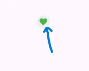
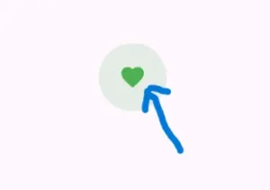
1. icon (Required)
IconButton(
  icon: Icon(Icons.favorite),
  onPressed: () {},
)
This shows a heart icon. When you tap on it, nothing will happen unless you specify an action using onPressed.
2. onPressed (Required)
This parameter is where you define what happens when the button is tapped.
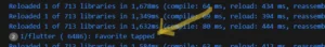
onPressed: () {
print('Favorite tapped');
},
Here, when you tap the favorite icon, it will print “Favorite tapped” to the console.
3. iconSize
This parameter allows you to change the size of the icon.
iconSize: 40.0
This makes the favourite icon bigger, setting its size to 40 logical pixels.
4. color
Use this to change the colour of the icon.
color: Colors.green
This will make the icon green, regardless of the theme or design of your app.
5. splashColor
This controls the color of the splash effect that shows when you tap the icon.
splashColor: Colors.purple
When you tap the icon, a purple splash effect will appear, showing a visual response to the tap.
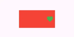
6. padding
This defines the space around the icon inside the button.
Container(
        color: Colors.red,
        child: IconButton(
              icon: Icon(Icons.favorite),
              iconSize: 40.0,
              color: Colors.green,
              splashColor: Colors.purple,
               padding: EdgeInsets.all(20.0),
              onPressed: () {
                print('Favorite tapped');
              },
            ),
          )
- In the code, the
paddingapplied to theIconButton(EdgeInsets.all(20.0)) increases the clickable area around the icon by 20 pixels on all sides, making it easier to tap. - The icon itself remains the same size, but the extra space around it improves user interaction. The Flutter container widget only provides a red background and doesn’t affect the padding; it simply wraps the
IconButton. - The
paddingensures a larger tappable area while theContainervisually enhances the button with a background color.
7. alignment
The alignment determines where the icon is placed inside the button.
Container(
        width: 200,
        height: 100,
        color: Colors.red,
        child: IconButton(
              icon: Icon(Icons.favorite),
              iconSize: 40.0,
              color: Colors.green,
              splashColor: Colors.purple,
              alignment: Alignment.centerRight, // Aligns the icon to the right
              onPressed: () {
                print('Favorite tapped');
              },
            ),
          ),
- In this example, the
alignment: Alignment.centerRightproperty is used to position the icon to the right side of the available space within theIconButton. - The
Containeris 200×100 pixels, and the icon is aligned to the right edge, leaving some space on the left. - This alignment shifts the icon towards the right while keeping its default size, making it appear closer to the right side of the container.
8. tooltip
A tooltip is a short message that appears when the user long-presses or hovers over the icon.
tooltip: 'Add to Favourites'
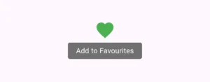
If the user long-presses or hovers over the icon, a message saying “Add to Favourites” will appear.
9. constraints
This controls the minimum size of the button so it doesn’t become too small.
constraints: BoxConstraints(minWidth: 50, minHeight: 50)
This ensures that the button is at least 50×50 pixels in size, even if the icon is smaller.
Bonus: Combining IconButton with Badge and Tooltip
You can combine multiple widgets, like Stack, to add extra features like a badge (notification count) along with the tooltip.
Tooltip(
 message: 'Notifications',
 child: Stack(
 children: [
   IconButton(
    icon: Icon(Icons.notifications),
    onPressed: () {},
   ),
   Positioned(
    right: 4,
    top: 4,
    child: Container(
    padding: EdgeInsets.all(4),
    decoration: BoxDecoration(
    color: Colors.red,
    shape: BoxShape.circle,
    ),
  child: Text(
   '3',
   style: TextStyle(
   color: Colors.white,
   fontSize: 10,
   ),
   ),
   ),
   )
  ],
  ),
 )

Explanation
Tooltip: A Tooltip widget is used to display a message (“Notifications”) when the user hovers over the IconButton or long-presses it on mobile devices.
Stack Widget: The Flutter stack widget allows multiple widgets to be stacked on top of each other. In this case, the
IconButtonwith notification badge is layered.IconButton: It displays a notification bell (
Icons.notifications) and triggers an action when tapped (onPressedis empty in this example).Positioned Widget: The
Positionedwidget places the notification badge in the top-right corner of theStack, with a 4-pixel distance from the right and top edges.Notification Badge: The badge is a red circle (
BoxDecoration(color: Colors.red, shape: BoxShape.circle)) containing the number ‘3’ using the Flutter text widget, styled with white text and a font size of 10 to indicate 3 notifications.
Conclusion
The IconButton widget in Flutter is a handy and simple tool for adding clickable icons to your app. It lets you create clean and minimalistic designs while offering customisation options like icon size, color, splash effects, and padding. You can also enhance it with features like tooltips and notification badges, making it very flexible for different use cases.
By understanding how to use its parameters and experimenting with them, you can easily fit the button into your app’s style. Whether you need a basic button or one with extra features, IconButton gives you all the tools to make your app more interactive and user-friendly. It’s an easy and effective way to make your app’s interface more engaging.
