Flutter Popup Menu Button Widget Explained
Sometimes showing more items covers most of the width or height of Flutter app’s screen, leaving less or no space for other items. Flutter popup menu button widget solves this problem by putting all these items in its menu popup.
This widget has multiple parameters through which we can customize the appearance of it as well. Let’s understand this Flutter popup menu with practical code examples and easy explanations.
About the Flutter Popup Menu Widget
As we discussed before this widget holds the items on its menu that should have took a lot of space on the screen. That may have resulted in overflow, not enough space for other items, or made the app look non-professional.
The items can be clickable and we can specify actions that will be triggered when the user clicks on them.
Theoretical Example
A simple one can be inside the Flutter appbar actions. Here we can put items like logout, profile, settings, etc. Putting too many items will make it look bad so that’s where popup menu will help us. You can use it anywhere else in your Flutter app too depending on your app’s requirements.
Let’s first go through its syntax, then I’ll explain its parameters with code examples so you have a complete idea of how to implement this popup menu widget in your own Flutter app with ease.
Syntax
PopupMenuButton(
      itemBuilder: (context) {
            return [
              PopupMenuItem() // it takes these
                   ];
          },
)- We’ve to use the PopupMenuButton widget to show the icon so we can press it to display the menu and then click on any one of its items to perform the desired task.
- It has a required parameter ‘itemBuilder as well which takes a function with BuildContext as an argument and returns a list of ‘PopupMenuEntry’ objects that are usually PopupMenuItem(). These items will specify the data in the menu.
Parameters of Popup Menu
- itemBuilder
- onSelected
- iconColor
- iconSize
- icon
- color
- elevation
- shape
Examples to explain Flutter Popup Menu Parameters
Example 1: itemBuilder parameter
List popupItemsList = [
    {'icon': Icons.settings, 'title': 'Settings'},
    {'icon': Icons.person_2, 'title': 'Profile'},
    {'icon': Icons.logout, 'title': 'Logout'},
  ];
PopupMenuButton(
itemBuilder: (context) {
return [
for (int i = 0; i < popupItemsList.length; i++)
PopupMenuItem(
value: popupItemsList[i]['title'],
child: ListTile(
leading: Icon(popupItemsList[i]['icon']),
title: Text(popupItemsList[i]['title']),
))
];
},
)
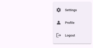
- First, I created a list of maps that has the name and icon key value pairs.
- As the itemBuilder returns a list so I used a for loop that will run and in its body, I passed it PopupMenuItem(). It has child parameter which takes a Flutter widget. For demonstration, I passed it a ListTile() widget. This list tile has leading and title so I passed it icon and text widget and the values passed to them are defined in the list of maps.
- The value parameter of popup menu item is used by the onSelected parameter of popup menu(see the next example). Here, I passed it the title.
- In the above images, the first one shows the default popup menu icon, and clicking it will display the popup menu with the specified items as seen in the second image.
- If you return an empty list, then clicking on the popup menu icon will not show any menu.
Example 2: onSelected parameter
onSelected: (value) {
            ScaffoldMessenger.of(context)
                .showSnackBar(SnackBar(content: Text(value.toString())));
          }
- This ‘onSelected’ parameter takes a call back function with a single argument. This argument will hold the data taken from the value parameter of popup menu item. This function is triggered when the user taps on the items of popup menu.
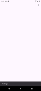
- Here, I specified a simple Flutter snackbar that will show on the screen when the user taps on popup menu item and will display its title as well as seen in the above image. You can specify navigation to other screens or other actions inside this function.
- Also, you can see that after tapping on item, the menu disappears.
Example 3: iconColor parameter
iconColor: Colors.red
Example 4: iconSize parameter
iconSize: 41
Example 5: icon parameter
icon: Icon(
            Icons.more_horiz,
            size: 31,
            color: Colors.green,
          )
- This icon parameter is used to display a custom widget as the popup menu button. By default, it’s a vertical icon. This parameter takes a Flutter widget so we can pass any we want.
- For visual explanation, I’ve passed it a Flutter icon with its own size and color. Keep in mind that if you pass icon and don’t specify its properties, then by default, the iconSize and iconColor values will be used.
Example 6: color parameter
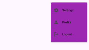
color: Colors.purple
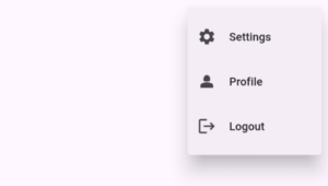
Example 7: elevation parameter
elevation: 20
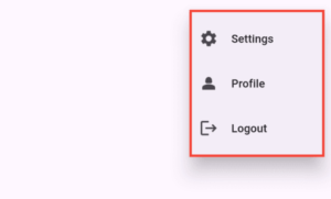
Example 8: shape parameter
shape: Border.all(
       color: Colors.red,
       width: 3,
       style: BorderStyle.solid,
       strokeAlign: BorderSide.strokeAlignInside)
- Border.fromBorderSide()
- Border.lerp()
- Border.merger()
- Border.symmetric()
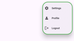
Example 8.1: round borders
 shape: RoundedRectangleBorder(
           borderRadius: BorderRadius.circular(31),
           side: BorderSide(color: Colors.green, width: 3))
- BorderRadius.horizontal()
- BorderRadius.vertical()
- BorderRadius.lerp()
- BorderRadius.only()
Conclusion
We have practically learned how to use the Flutter popup menu button widget and its parameters with easy code examples and explanations. If you still find any trouble, then you should feel free to comment or email me. I’ll be happy to help you.
Thank you and do visit my other posts on some amazing Flutter widgets and concepts that will make your app more professional and easy to use.

