How to use Flutter Textformfield Widget
Flutter textformfield widget in Flutter app is used to take input from the user and process it. We’ll go through the parameters of textformfield with easy code examples fully so you can customize it in your project with ease.
What is Flutter Textformfield and its importance in a Flutter App?
As I have explained in the beginning that this widget is used to take data from the user. For instance, in a login screen, the user can enter his/her email and password and for other screens he/she can put the required data using a field that can a Flutter textfield, textformfield or some other field that can take inputs. So, that’s the purpose and importance of textformfield widget.
Let’s now leave the boring part and jump into the practical code examples.
Syntax
TextFormField()

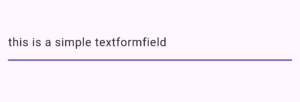
This is the simple syntax of textformfield and this is how we can call this widget. In the above image we see a textformfield with a default underline border. We also gave it some input to prove that its a field that accepts input from a user.
Flutter Textformfield Decoration Parameter (for designing the field)
decoration: InputDecoration()
This parameter is used to design the field. It takes an InputDecoration class and by using its properties, we can customize our field however we like. I’ll explain it in the below section with proper code examples.
Parameters of Textformfield Flutter
These are:
- decoration (this will cover the input decoration in detail with multiple code examples)
- autofocus
- focusNode
- canRequestFocus
- validator
- style
Practical Code Examples with Explanations
Example 1: Flutter Textformfield Decoration
In this block, we’ll cover the decoration paramater of textformfield.
Example 1.1: hintText parameter
decoration: InputDecoration(
              hintText: 'Enter your name'
             )

Example 1.2: hintStyle parameter
hintStyle: TextStyle(
      color: Colors.green.withOpacity(.4),
      fontSize: 18,
      fontWeight: FontWeight.w500,
                  )
Example 1.3: labelText and labelStyle
labelText: 'This is label text',

labelStyle: TextStyle(
      color: Colors.purple,
                  )


Example 1.4: label parameter
label: Text('This is also a label')

Example 1.5: errorText and errorStyle parameter
  errorText: 'This is error text',
  errorStyle:
          TextStyle(
              fontStyle: FontStyle.italic,
              fontSize: 13)
Example 1.6: error parameter
error: Container(
      height: 11,
      width: 41,
      color: Colors.red,
                  ),

Example 1.7: border parameter of textformfield
border: InputBorder.none

Example 1.8: enabledBorder of Flutter textformfield widget
enabledBorder: OutlineInputBorder(
          borderRadius: BorderRadius.circular(21),
          borderSide: BorderSide(
          color: Colors.blue,
          width: 1.5,
                    ),
                  )

borderRadius: BorderRadius.circular(11).copyWith(topLeft: Radius.circular(0))

Example 1.9: focusedBorder of textformfield Flutter
focusedBorder: UnderlineInputBorder(
     borderSide: BorderSide(
      color: Colors.orange,
      width: 4,
           ),
           )
Example 1.10: prefixIcon of textformfield Flutter
prefixIcon: Icon(Icons.email)
![]()
This prefixIcon parameter takes a widget and its role is to show an icon at the starting means left position of Flutter textformfield as shown in the above image. You can pass it any widget you like, for instance, a Flutter dropdown, Flutter container or some other widget but for this example, I have passed it an email icon using Flutter icon widget. You can easily change the icon color, size of icon and more.
Example 1.11: suffixIcon parameter
suffixIcon: Icon(Icons.visibility)
The suffix icon also takes a widget and it shows that widget in the end/right side in the textformfield widget. In that example too, I have passed it an icon widget but you can pass any widget that meet your app requirements.
Example 1.12: filled parameter
filled: true

Example 1.13: fillColor parameter
fillColor: Colors.blue

If you want to change the Flutter textformfield background color, then use the filledColor parameter of input decoration class. It takes a color so for demonstration, I’ve passed it a blue color.
Keep in mind that in order for this color to show as the background color of textformfield, you have to make the filled parameter true, if its’ false then the background color won’t be visible.
Example 2: autoFocus parameter
autofocus: true
Example 3: focusNode parameter of Flutter Textformfield
FocusNode _focusNode = FocusNode();
Column(
        mainAxisAlignment: MainAxisAlignment.center,
        children: [

          Padding(
            padding: EdgeInsets.all(11),
            child: TextFormField(
              focusNode: _focusNode,
            ),
          ),

          Padding(
            padding: EdgeInsets.all(11),
            child: TextFormField(),
          ),

          MaterialButton(
            onPressed: () {
              _focusNode.requestFocus();
            },
            child: Text('Focus first field'),
          )
        ],
      ),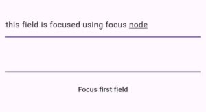
- The parameter focusNode can be used to specify when to focus which text form field as it can manage the focus state of this field or other fields that have the focus property.
- First we created an instance(_focusNode) of the Focus Node class, then assigns it to just the first textformfield widget. We created 2 fields to show you that the focus of first will change programatically. You can use multiple focus nodes and assigns them to different text form fields as well.
- We created a simple material button as well and inside it we call the request focus method of the focus node object. This will shift the focus to the field and make it focused. In our case, we have passed the ‘_focusNode’ to the focus node parameter.
- To demonstrate it, first both fields were unfocused, but when we click on the material button widget then request focus was called and as a result the field with ‘_focusNode’ got focused.
Example 4: canRequestFocus of Textformfield Flutter
canRequestFocus: false
- This parameter is used to prevent the specific textformfield to gain focus. It takes a Bool value and by default, its true.
- I set it to false and now when I press the material button to get it focused or even tapping on this field then still it didn’t get focused. So set it to false for any field you don’t want to get focused.
- Even autoFocus won’t make it focused if the canRequestFocus is set to false for that field.
Example 5: validator of Flutter textformfield
In this example, we’ll understand how to validate a password field using Flutter textformfield validator. See below steps:
Step 1: Create Global Key
final _formKey = GlobalKey<FormState>();
I first created a global key that will identify the specific form in which we’ll work. It’ll fetch the state of that form so we can see validation.
Step 2: Form Widget
Form(
  key: _formKey,
  child: // the textformfield will come here
)
We have to use the form widget and pass the global key specified above to its key parameter. This will manage the state of fields so you have to wrap the fields with it. In our case its text form field widget. If you have multiple fields then just pass a column widget to the child parameter of form widget and specify all the fields there.
Step 3: logic in Flutter textformfield validator
Form(
     key: _formKey,
          child: TextFormField(
            validator: (value) {
              if (value == null || value.isEmpty) {
                return 'Password cannot be empty';
              }
              if (value.length < 8) {
                return 'Password must be at least 8 characters long';
              }
              if (!RegExp(r'[!@#$%^&*(),.?":{}|<>]').hasMatch(value)) {
                return 'Password must contain at least one special character';
              }
              if (!RegExp(r'\d').hasMatch(value)) {
                return 'Password must contain at least one numeric digit';
              }
              return null; // Password is valid
            },
          ),
),Step 4: trigger the validation using button
 ElevatedButton(
        onPressed: () {
            if (_formKey.currentState!.validate()) {
               ScaffoldMessenger.of(context).showSnackBar(
                   SnackBar(content: Text('Data is valid')),
                  );
                }
              },
              child: Text('Submit'),
)Step 5: Test the Validator
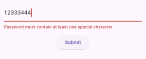
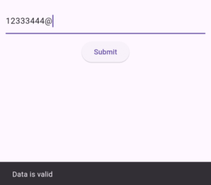
I first pass it an invalid data that doesnot meet the condition I specified inside the function passed to the validator parameter and pressed the button as seen in the first image.
In the second one, I gave it the valid string which meets the conditions and therefore the field is validated. As a result, a snackbar is shown on the screen.
Example 6: style parameter
The Flutter textformfield style parameter is used to style the input data that is entered by the user. For instance, when a user click on the textformfield and enter something then we can decorate that data using the style parameter of textformfield widget.
Let’s first see how the data will look by default.
Example 6.1: Default style

Example 6.2: Custom style
style: TextStyle(color: Colors.pinkAccent, fontSize: 21)

You can see that the style parameter takes a text style. So, for demonstration, I just changes the color of text and its size. You can play with other properties of textstyle as well to decorate your entered data of textformfield more.
Conclusion
So now you have a detailed practical knowledge of how to implement a Flutter textformfield widget and how to properly customize its design. Do comment if you have any questions or problems related to this Flutter widget.
Thank you and stay tuned for more info on Flutter app development.

