How to use Flutter Container Widget
Having a widget that have properties like color, padding, shape, shadow, etc. is really helpful in Flutter. That’s where Flutter container widget plays its part.
This Flutter widget has so many amazing properties which we’ll discuss practically. Parameters of container widget will be explained with easy Flutter code examples to make this learning super easy for you.
What is Flutter Container Widget?
As we discussed in the intro, this widget has many features that we can use.
We can change its color, give size to it, create space between container and its parent widget. Infact we can give a child widget to this container and create a space between container and that child widget too which will be done using padding.
We can easily give a shadow effect to our container to make it look elevated and more beautiful. For further interactivity, you can add widgets like the Flutter icon button inside the container.
Let’s now jump into its practical part. First, we’ll have a simple overview of its syntax and then we’ll go through parameters of Flutter container and understand them with code examples.
Syntax
Container( child: //its child widget will come here )
- We can define this widget using the name ‘Container’ with parenthesis.
- The child parameter is not required but its use to give a child widget to container.
- You won’t see anything on your Flutter app screen because this container has no size yet, no child, and no other properties but still its there on the screen.
Parameters of Flutter Container class
Flutter container parameters are listed below:
- child
- color
- height
- width
- alignment
- padding
- margin
- decoration
- border
- color (parameter of BoxDecoration() class)
- border
- borderRadius
- boxshadow
Examples to explain the implementation of Container Widget Flutter
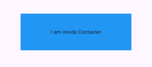
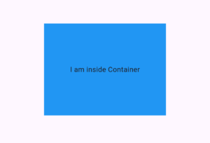
Example 1: child parameter
Container(
      child: Text('I am inside Container')
    )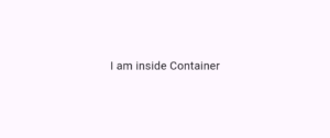
The child parameter of the container takes a Flutter widget so I passed it a text widget, you can pass any widget as a child, including complex ones like a Flutter Table. In the later examples, I’ll customize the height, width, and color so you can see the container properly.
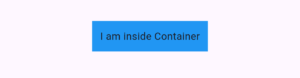
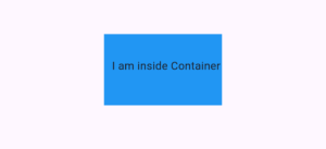
Example 2: color parameter
color: Colors.blue
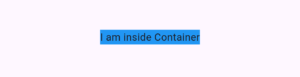
Note:
If you are using the decoration parameter then use the color parameter of BocDecoration() not the color parameter of Container() class or else error will occur. I’ll explain the decoration in below examples.
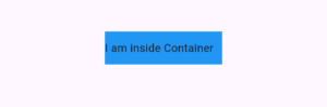
Example 3: height parameter
height: 100
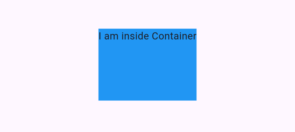
Example 4: width parameter of Flutter Container Widget
width: 300
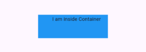
Example 5: alignment parameter
alignment: Alignment.center
- Alignment.bottomCenter
- Alignment.bottomLeft
- Alignment.bottomRight
- Alignment.centerLeft
- Alignment.centerRight and many more
Example 6: padding parameter of container
padding: EdgeInsets.all(11)
Example 6.1: using copyWith() method
EdgeInsets.all(11).copyWith(left: 0)
Example 6.2: EdgeInSets.only()
EdgeInsets.only(left: 40, right: 20, bottom: 44, top: 2)
Example 6.3: EdgeInsets.symmetric()
EdgeInsets.symmetric(horizontal: 51, vertical: 80)
Example 6.4: EdgeInsets.zero
EdgeInsets.zero
Example 6.5: EdgeInsets.fromLTRB()
EdgeInsets.fromLTRB(10, 30, 2, 40)
You can use this LTRB() method too to give the same or different space to each side of the child widget within container. The full form of LTRB is left, top, right, and bottom.
Practice the below methods of EdgeInsets, implement it in your app and give feedback in the comments.
- EdgeInsets.fromViewPadding()
- EdgeInsets.lerp()
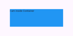
Example 7: margin parameter
margin: EdgeInsets.all(21)
Container(
      color: Colors.green,
      child: Container(
        margin: EdgeInsets.all(21), //space from outside using margin
        padding: EdgeInsets.all(11),
        color: Colors.blue,
        child: Text(
          'I am inside Container',
          style: TextStyle(color: Colors.white, fontSize: 17),
        ),
      ),
    )
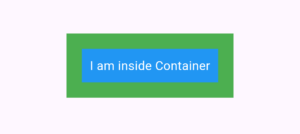
- I gave the above container a parent container with a green background color.
- Then specify the margin which takes EdgeInSets like the padding parameter.
- The difference between padding and margin is that padding creates a space from inside, while margin creates space from outside the container.
- You can easily change the margin by implementing the methods I’ve specified in the padding section (see example 6). It takes the same methods as all, only, symmetric, etc.
- You can use the copyWith() method here as well.
Example 8: decoration parameter
decoration: BoxDecoration()
This is the important parameter of this widget for decoration. The Flutter container decoration parameter takes the BoxDecoration() class, and using properties of this class, we can design our container. These design principles are useful when styling UI elements like a bottom navigation bar with rounded corners and shadows for a modern look. So, let’s get started.
By the way, you can enhance your design elements with Flutter animations to add transitions, fade effects, and animate changes in shape, size, and more.
Example 8.1: color parameter of BoxDecoration()
color: Colors.blue
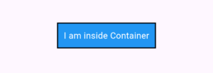
Example 8.2: border parameter
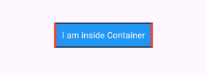
border: Border.all(
            color: Colors.black,
            width: 2,
            style: BorderStyle.solid,
          )
Example 8.2.1: border.symmetric()
border: Border.symmetric(
            horizontal: BorderSide(
              color: Colors.black,
              width: 2,
              style: BorderStyle.solid,
            ),
            vertical: BorderSide(
              color: Colors.red,
              width: 5,
              style: BorderStyle.solid,
            ))
- Border.fromBorderSide()
- Border.lerp()
- Border.merge()
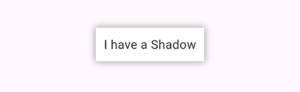
Example 8.3: borderRadius parameter
borderRadius: BorderRadius.circular(11)
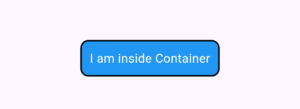
The ‘borderRadius’ is used to give a circular shape to the edges of container. The circular method is used to give the same circular value to all 4 edges as seen in the above image. You can use copyWith() method with this method and other methods of BorderRadius() too.
Examples of other methods are below.
Example 8.3.1: BorderRadius.all()
BorderRadius.all(Radius.circular(8))
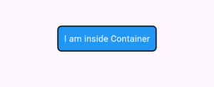
It’ll also make all the edges of container of same circular shape.
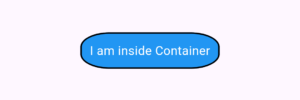
Example 8.3.1.1: Passing Radius.elliptical() to BorderRadius.all()
BorderRadius.all(Radius.elliptical(40, 20))
Example 8.3.1: BorderRadius.horizontal()
BorderRadius.horizontal(
            left: Radius.circular(9),
            right: Radius.circular(20))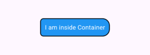
Example 8.3.1: BorderRadius.vertical()
BorderRadius.vertical(
            top: Radius.circular(6),
            bottom: Radius.circular(15))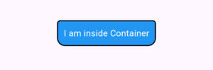
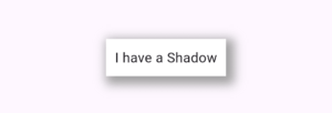
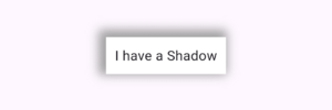
Example 8.4: boxShadow parameter
boxShadow: [
        BoxShadow(
          blurRadius: 7,
          spreadRadius: 1,
          color: Colors.grey,
        )
      ]
 This boxShadow parameter takes a list of BoxShadow() class. It’s used to give shadows/elevated effect to Flutter container widget.
Parameters of BoxShadow
- color – This sets the color of shadow.
- spreadRadius – This shows how much the shadow should spread from container. It can take position or negative value. Positive will spread it whereas negative will shrinks it.
- blurRadius – This is used to specify the blur effect on the shadow. Giving it larger value will increase the blur, so try it with different values until you get your desired shadow.
- offset – This takes an Offset() object which have 2 parameters. First is for horizontal and second is for vertical. It sets the shadow position. See below examples for visual understanding.
- blurStyle – This sets the appearance of shadow effect whether you want it to be normal, inner,outer, solid, or values. This is how you can use it. ‘blurStyle: BlurStyle.normal’, try it with the properties and see which works for you.
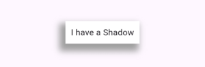
Example 8.4.1: offset parameter
Let’s understand the offset with different values.
Example 8.4.1.1: positive Offset values
offset: Offset(5, 5)
Example 8.4.1.2: negative Offset values
offset: Offset(-4, -4)
We can give negative values too. It’ll move in the opposite direction now. Now the direction is left and top so the shadow is positioned to top left.
Example 8.4.1.3: Offset with positive and negative values
offset: Offset(-7, 10)
Conclusion
Now you have a complete practical understand of how to properly use and easily customize Flutter container widget. I’ve used multiple easy Flutter code examples to explain the parameters of container class.
If you still find any issue related to this widget then do comment or email me. I’ll be very happy to help you.
Also, if you’re interested in other amazing Flutter widgets, then must visit my other posts as well. Thank you.