How to use Flutter Dropdown Button Widget (21 Code Examples)
What is the Flutter dropdown button widget? Its role, parameters, and how to properly implement and customize it in our Flutter code.
All these questions have been answered in this article.
Step-by-step implementation of Flutter dropdown button with code examples for your better understanding.
So, let’s get started.
What is Flutter Dropdown Button Widget and its Importance?
This dropdown is a material design button that when you tap, it then shows a menu dropdown that has a list of items from which you can select. So, it actually gives you a list of options from which you can select an item.
It’s an important and visually appealing part of any Flutter app. For instance, you want the user to select his/her age, selection of country, height, or any other list of options. So must use the Flutter dropdown where it’s needed in your Flutter app to make the app look more professional.
Basic Syntax of Dropdown Button
DropdownButton()
Constructors of Dropdown
The list of constructors that this dropdown has is divided into 2 sections.
1. Required parameters
- items
- onChanged
2. Optional parameters
- value
- hint
- disabledHint
- elevation
- style
- underline
- icon
- iconDisabledColor
- iconEnabledColor
- iconSize
- isDense
- isExpanded
- itemHeight
- focusColor
- focusNode
- autofocus
- dropdownColor
- padding
- alignment
- borderRadius
- enableFeedback
Explaining these Parameters with Practical Code Examples
Example 1: Using the ‘items’, ‘onChanged’, and ‘value’ parameters
String? selectedValue;
DropdownButton(

        value: selectedValue,

        items: [
          DropdownMenuItem<Object>(
            value: 'Cars',
            child: Text('Cars'),
          ),
          DropdownMenuItem<Object>(
            value: 'Bikes',
            child: Text('Bikes'),
          ),
        ],

        onChanged: (Object? value) {
          setState(() {
            selectedValue = value.toString();
          });
        },
      )


Explanation
- We first created a nullable string that will be used to hold the current value that is selected from the dropdown. In the first image, you can see a simple icon and actually that is the default icon of the dropdown. No value is selected yet so it shows nothing.
- I have passed this variable to the value parameter of the dropdown button widget. Now it will show the value that is present in that variable.
- The items parameter takes a list of dropdown menu item widgets. In our case, we have passed just 2 for the sake of explanation. These widgets have a value constructor which actually holds the value of that item. The child parameter takes a widget, so we have passed it a text widget and it will be shown in the dropdown menu. You can pass other widgets as well depending on your requirements.
- The onChanged parameter has a call back function that is called when the user selects/taps on an item from the dropdown menu. The selected item value is passed as parameter to this function and here we have assigned it to our ‘selectedValue’ variable. We’ve used to toString() method to convert the object to string before assigning it.
- We’ve also used the setstate to perform a rebuild so the changes can be seen on the screen as well.
- In the second image, we can see that after clicking on the Flutter dropdown button, a menu appears and we have selected a value which is now showing in the button as well.
- You don’t need to write the same dropdown menu item again and again, instead you can use a for loop for it and just assign the values, see below example.
Dropdown Menu with For Loop
List listOfItems = ['ships', 'planes', 'vehicles'];
items: [

          for (int i = 0; i < listOfItems.length; i++)
            DropdownMenuItem<Object>(
              value: listOfItems[i],
              child: Text(listOfItems[i]),
            ),
        ],
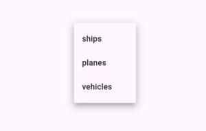
This is how you can make your code efficient, clean and save a lot of time.
Example 2: ‘hint’ parameter
hint: Text('Select an option')
Example 3: ‘disabledHint‘ parameter
disabledHint: Text('Dropdown is disabled'),
onChanged: null
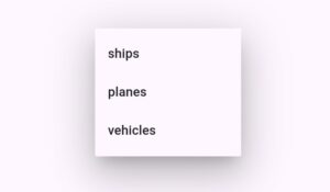
Example 4: ‘elevation’ parameter
elevation: 24
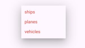
Example 5: ‘style’ parameter
style: TextStyle(color: Colors.red, fontSize: 21)

Example 6: ‘underline’ parameter
underline: Container(
          height: 2,
          color: Colors.blue,
        )

Example 7: ‘icon’ parameter
icon: Icon(Icons.person)
Example 8: ‘iconDisabledColor’ and ‘iconEnabledColor’ parameter
iconDisabledColor: Colors.green,
iconEnabledColor: Colors.blue
Example 9: ‘iconSize’ parameter
iconSize: 37
Example 10: ‘isDense’ parameter
isDense: true

Example 11: ‘isExpanded’ parameter
isExpanded: true

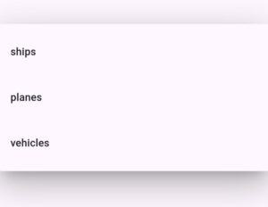
Example 12: ‘itemHeight’ parameter
itemHeight: 70
Example 13: ‘focusColor’ parameter
focusColor: Colors.red
This parameter specifies when the button is focused or selected, the change the color or underline or other indicators to show that this specific Flutter dropdown button is focused. It can be used when there are multiple dropdown buttons.
Example 14: ‘autoFocus’ parameter
autofocus: true
Example 15: ‘focusNode’ parameter
final FocusNode _dropdownFocusNode = FocusNode();
focusNode: _dropdownFocusNode, // Assigning focusNode
Example 16: ‘dropdownColor’ parameter
dropdownColor: Colors.blue
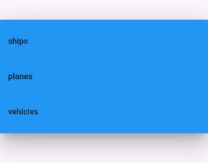
Example 17: parameter of ‘padding’
padding: EdgeInsets.all(40)

Example 18: ‘alignment’ parameter
alignment: Alignment.topLeft

Example 19: ‘borderRadius’ parameter
borderRadius: BorderRadius.circular(20)
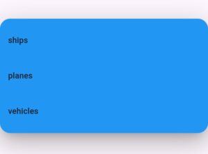
Example 20: Using copyWith method
BorderRadius.circular(20).copyWith(bottomLeft: Radius.circular(5))
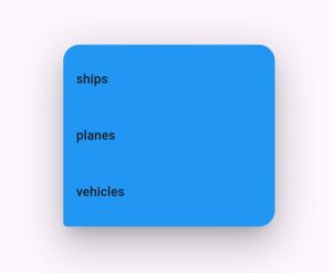
Here you can see that the bottom left radius of Flutter dropdown menu is less as compared to the other edges.
Example 21: Flutter dropdown enableFeedback parameter
enableFeedback: true
Conclusion
Hope you have a clear practical understanding of how to properly customize the Flutter dropdown button widget. Do read it again or ask questions in case you have any queries. I’ll be more than happy to answer your questions.
If you have any issues in setting up Flutter on your PC, then I’ve created an article in which step-by-step installation of Flutter is discussed practically.
Thank you for reading and stay tuned for more.

