How to use Flutter ShowDialog | Code Examples
If you want to display an ad popup, confirmation box, or something that would take the attention of the user, then the Flutter showDialog function is what you need.
We can display a Flutter widget in it which will be shown on the screen as modal overlay above other widgets. This showDialog function and its parameters will be explained with practical code examples and detailed explanations so you can understand and use it properly.
What is Flutter ShowDialog Function?
It shows a material dialog in front of currently displaying Flutter widgets. We can specify a custom widget that will be shown in the dialog. We can also tap outside the body to close this dialog or specify a custom widget in the dialog to dismiss/close it.
Let’s understand its simple syntax first then we’ll go through its parameters using code examples so you can properly understand how to use it in your own Flutter app.
Syntax
showDialog(
  context: context,
  builder: (BuildContext context) {
   // here any widget can be used
}
);- By using showDialog() function, we can easily show a dialog.
- It has 2 required parameters. These are ‘context’ and ‘builder’.
- The context parameter is used to tell this dialog where it should display itself in the Flutter app’s widget tree.
- The builder parameter takes a function and it returns the widget. This widget will be shown in the dialog. You can return any widget in the builder function like a Flutter textformfield, container, text widget, etc.
Parameters
- context
- builder
- barrierDismissible
- barrierColor
- barrierLabel
- useSafeArea
- routeSettings
Code Examples to explain Flutter showDialog Function
Example 1: ‘context’ and ‘builder’ parameter
ElevatedButton(
   onPressed: () {
       showDialog(
          context: context,
          builder: (BuildContext context) {
             return Center(
                child: Container(
                   height: 200,
                   margin: EdgeInsets.all(21),
                   color: Colors.white,
                   alignment: Alignment.center,
                     child: Text(
                       "Hey there, Happy coding to you!",
                       style: TextStyle(
                          color: Colors.black,
                          fontSize: 16,
                          decoration: TextDecoration.none),
                        ),
                      ),
                    );
                  });
            },
       child: Text('Click to show Flutter Show Dialog'))
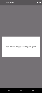
- I first created a simple elevated button with a child text widget. In its ‘onPressed’ function, I passed it the showDialog function.
- Here, I passed the BuildContext(context) to the context parameter of the show dialog.
- Then a center widget to the function that the builder parameter takes to show its child widget in the center of the screen. I gave this Center() a child Flutter container widget.
- The container has some height, margin, color, and child text just to show you how it will look.
- If you see some unusual decoration of text by default, then simply use its text style class to decorate it.
- I tapped on the elevated button which triggered the dialog to be displayed on the screen.
- If you click on its dimmed background then it’ll dismiss/close this dialog.
Example 2: Custom Dialog Size
 return Dialog(
        shape: RoundedRectangleBorder(
        borderRadius: BorderRadius.circular(31)),
        child:
          Container(
            height: 300,
            width: 200,
            color: Colors.blue.shade100,
            // other decoration
                   )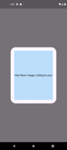
- This size of the dialog is controlled by the size of widget returned by the builder function. Some widgets have default sizes like SimpleDialog and AlertDialog. In the above example, I just wrapped our container with a Dialog() widget and gave this widget some border radius to make its border shape a bit circular.
- Also, I changed the size of the container and color so this container and the dialog widget is shown clearly.
- You can use other ways to customize the size of container like margin, padding, wrap with column, etc.
Example 3: Using Material, Stateful Builder, setState inside showDialog Flutter
bool isChecked = false;
Material(
   child: StatefulBuilder(builder: (context, setState) {
      return Row(
         mainAxisAlignment: MainAxisAlignment.center,
            children: [
               Checkbox(
                value: isChecked,
                 onChanged: (value) {
                   setState(() {
                    isChecked = !isChecked;
                               });
                                },
                              ),
                 Text(isChecked ? 'Checked' : 'Unchecked')
                              ],
                            );
                          }),
                        )

- I am using the same widget returning logic in the builder function as shown in the above examples but with modified code.
- Here, I specified a simple row with a children’s Flutter checkbox and a text widget.
- When you click the checkbox, it changes the boolean value it uses to decide if it’s checked or not. If the value is true, the checkbox will show a tick and if false, then the tick will be invisible. The text will also be changed using this boolean. If it’s true then ‘Checked’ will be shown, or else, ‘Unchecked’. The Flutter setState updates the screen to show these changes.
- The Material widget is super important for rendering material design components which in our case is Checkbox widget. If you don’t use Material in showDialog, then an error will occur because the checkbox needs the material design elements for proper rendering.
- Also, the stateful builder is necessary if you want to show the local UI updates in the widget returned by the function of the builder.
Example 4: Close Dialog with Custom Button
ElevatedButton(
    onPressed: () {
       Navigator.of(context).pop();
                  },
         child: Text('Close'))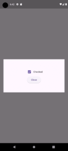
Example 5:
barrierDismissible parameter (Custom Dismiss Behavior)
barrierDismissible: false
This parameter is of type boolean and by default, it’s set to true. This means if you tap outside the dialog, it will automatically close.
If you set it to false, then tapping outside cannot close the dialog. You must specify an action inside the dialog, like pressing a button to close it as we’ve done in example 4.
Example 6: barrierColor parameter
barrierColor: Colors.purple.withOpacity(0.3)
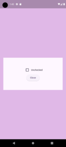
The barrier color parameter in Flutter showDialog specifies the color and transparency of the dimmed background shown behind the dialog. By default, it shows a semi-transparent black color, but you can customize it to any color or opacity. I gave it a purple color with some opacity and you can see the result in the above image.
Example 7: barrierLabel parameter
barrierLabel: 'This is barrier label'
Example 8: useSafeArea parameter
useSafeArea: false
This parameter of Flutter showDialog controls whether the dialog stays within safe areas of the app’s screen, like around the phone’s status bar, notch, or bottom navigation bar. It takes a boolean value and it is true by default.
- When it’s true, then the dialog will not overlap with things like the status bar or notch which will keep everything visible.
- But if it’s false, the dialog can go into parts of your Flutter app’s screen like the status bar or notch. This means the dialog might cover those areas that will make it look like it’s taking up more of the screen, almost like a fullscreen view.
This option is useful when you want more control over how the dialog is positioned on the screen.
Example 9: routeSettings parameter
 routeSettings: RouteSettings(
                    name: 'customDialog',
                    arguments: {'id': 123},
                  )
This is used to provide extra information about the dialog when it is displayed in the navigation system. This includes:
- Name of the route: You can give a specific name to the dialog, which helps track or identify it in your app’s navigation history.
- Arguments: You can pass data (like variables or objects) to the dialog by making use of its arguments parameter. This is used if the dialog needs to display or process specific information.
In the above code, I specified the route settings with a custom name and arguments.
The route settings can also be used for analytics, logging, and managing state in complex apps that have dynamic dialogs.
Conclusion
I have explained how to properly use and customize the Flutter showDialog function with easy and in-depth code examples so you can easily implement the show dialog function in your own Flutter app as well. If you still find something about this function that you are confused with, then comment or email me. I’ll be super happy to help you with it.
Thank you and don’t forget to visit other posts on this site for more important and interesting Flutter information about widgets, state management, and more.

