How to use Flutter SingleChildScrollView Widget
You can simply use it using the SingleChildScrollView(child: //Pass a widget) class. You just need to pass a Flutter widget to its child parameter.
Let’s understand the role of Flutter singleChildScrollView widget inside a Flutter app. We’ll first go through its theoretical part, then implement it by practically understanding its parameters with Flutter code examples.
What is Flutter singleChildScrollView Widget?
This widget is used to give a scrolling effect to its child. There are cases when the content we have on screen exceeds the screen width/height or you can say that exceeds its parent size, resulting in an overflow error.
In these cases, the SingleChildScrollView widget helps us by giving the child a scroll effect so that even if the item size exceeds, we can still scroll to see the whole content without any overflow.
Similarly, when dealing with a dynamic list of items, we can use the Flutter ListView.builder, which efficiently renders only the visible items with smooth scroll. But if you want to display items in a good structured grid format, then use the Flutter GridView widget for a flexible and scrollable grid layout.
Syntax
SingleChildScrollView(
        child: //here comes the child of single child scroll view
      )
Parameters
- child
- padding
- scrollDirection
- reverse
- physics
- controller
If you’re working with structured data, then try using a Flutter table instead of a scrollable column for better organization.
Code examples to explain the use of singleChildScrollView Flutter Widget
Example 1: child Parameter
Example 1.1: Column widget without singleChildScrollView
Column(
      children: [
        for (int i = 0; i < 10; i++)
          Container(
            margin: EdgeInsets.all(11),
            height: 71,
            width: double.infinity,
            color: Colors.purpleAccent,
          )
      ],
    )
Explanation
- First, I created a simple column widget.
- Then in its children list I specified a for loop and it will loop 10 times.
- After that, I used a simple Flutter container widget with some height, width, color, and some margin to give some space to the containers.
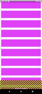
- Here, you can see that the size of items exceeds the screen’s height and an overflow error is seen on the screen. We can fix it by wrapping this column widget with a single child scroll view. See the below example.
Example 1.2: Column widget with singleChildScrollView
SingleChildScrollView(
      child: Column(
          // the data specified in the above example
              )
         )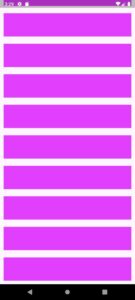
Now you can see that the overflow is gone. I tried to scroll it and it’s scrolling perfectly fine. I just passed the column widget to the child parameter of Flutter single child scroll view and it’s now scrollable. Keep in mind that the scroll is only helpful when the items exceed their parent size.
Example 2: padding parameter of Flutter singleChildScrollView
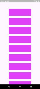
padding: EdgeInsets.all(80)
padding: EdgeInsets.all(80).copyWith(top: 0)Example 3: scrollDirection parameter
SingleChildScrollView(

        scrollDirection: Axis.horizontal,

        child: Row(
          children: [
            for (int i = 1; i < 14; i++)
              Container(
                alignment: Alignment.center,
                margin: EdgeInsets.all(9),
                height: 71,
                width: 81,
                color: Colors.purpleAccent,
                child: Text(i.toString()),
              )
          ],
        ),
      )
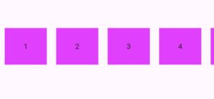
- The scrollDirection parameter sets the direction in which the scroll will happen. By default, its set to vertical(top to bottom and vice versa).
- In this example, I used a Flutter row widget and specified the container with for loop just like I’ve specified in the column widget. I also gave it a text widget to just simply show the index value too.
- I’ve used the horizontal property of ‘Axis’ and passed it to the scrollDirection of singleChildScrollView widget. In the above, image you can see that I can now scroll the child widget which is row horizontally(left to right and vice versa).
Example 4: parameter ‘reverse’
reverse: true
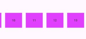
This reverse parameter specifies that from which position(starting point) the scroll should start. By default, its set to false because it takes a Boolean value and it means that it’ll be from the start(in our case its left). But I passed it value ‘true’ which means it will start the scrolling from the end (right in our case because I set it to true).
To make things simple, just remember that it will start from the opposite direction when the reverse is true. You can see in the above image that the scroll starts from the end(right in our case).
Example 5: ‘physics’ parameter
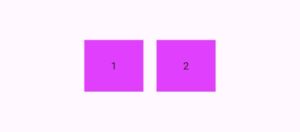
This parameter deals with the user gestures(taps,scroll,behave) and how the single child scroll view should behave according to the gestures. Like what to do when the user try to scroll the items, what to do when the user finishes the end of scrolls and more.
Let’s understand the different behaviours with some classes of ‘ScrollPhysics‘ with code examples.
Example 5.1: AlwaysScrollableScrollPhysics() class
physics: AlwaysScrollableScrollPhysics()
Example 5.2: BouncingScrollPhysics() class
physics: BouncingScrollPhysics()
Example 5.3: NeverScrollableScrollPhysics() class
NeverScrollableScrollPhysics()
Example 6: singleChildScrollView inside a fixed height and width
Center(
      child: Container(
        height: 150,
        width: 150,
        decoration: BoxDecoration(color: Colors.purple, boxShadow: [
          BoxShadow(blurRadius: 5, spreadRadius: 1, color: Colors.grey)
        ]),
        child: SingleChildScrollView(
          child: Column(
            children: [
              for (int i = 1; i < 10; i++)
                Container(
                  alignment: Alignment.center,
                  margin: EdgeInsets.all(9),
                  height: 70,
                  width: 150,
                  color: Colors.purple.shade100,
                  child: Text(i.toString()),
                )
            ],
          ),
        ),
      ),
    )
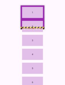
Without singleChildScrollView
With singleChildScrollView
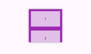
- Here I have used a container with a height, width, color and some shadow for decoration and inside it I specified a simple column with items.
- In the first image, I haven’t used single child scroll view and you can see an overflow when the items size exceeds the height of container.
- While in the second image, I only wrapped the column widget with single child scroll view and now you can see that the error is gone and I can easily scroll the items inside container.
- This was a simple example of how to can use this single child scroll view widget like this as well.
Example 6: controller parameter
class CustomScrollWidget extends StatefulWidget {
  @override
  _CustomScrollWidgetState createState() => _CustomScrollWidgetState();
}

class _CustomScrollWidgetState extends State<CustomScrollWidget> {

  final ScrollController _scrollController = ScrollController();
  bool _showScrollToTopButton = false; // For the floating action button

  @override
  void initState() {
    super.initState();
    // Listen to scroll changes
    _scrollController.addListener(() {
      print('Current scroll position: ${_scrollController.position.pixels}');
      // Show/hide the scroll-to-top button dependings on scroll position
      if (_scrollController.position.pixels > 100) {
        setState(() {
          _showScrollToTopButton = true;
        });
      } else {
        setState(() {
          _showScrollToTopButton = false;
        });
      }
    });
  }

  @override
  void dispose() {
    // Dispose the controller to free up resources
    _scrollController.dispose();
    super.dispose();
  }

  void _scrollToTop() {
    _scrollController.animateTo(
      0,
      duration: Duration(seconds: 1),
      curve: Curves.easeInOut,
    );
  }

  void _scrollToBottom() {
    _scrollController.animateTo(
      _scrollController.position.maxScrollExtent,
      duration: Duration(seconds: 1),
      curve: Curves.easeInOut,
    );
  }

  @override
  Widget build(BuildContext context) {
    return Scaffold(
      appBar: AppBar(
        title: Text('You can scroll up or down'),
        actions: [
          IconButton(
            icon: Icon(Icons.arrow_downward),
            onPressed: _scrollToBottom,
          ),
        ],
      ),

      body: SingleChildScrollView(
        controller: _scrollController, // Attach controller to the scroll view
        child: Column(
          children: List.generate(
            50,
            (index) => Padding(
              padding: EdgeInsets.symmetric(horizontal: 11, vertical: 4),
              child: ListTile(
                  tileColor: Colors.purple.shade700,
                  shape: RoundedRectangleBorder(
                      borderRadius: BorderRadius.circular(41)),
                  title: Text(
                    'Item $index',
                    style: TextStyle(color: Colors.white),
                  )),
            ),
          ),
        ),
      ),

      floatingActionButton: _showScrollToTopButton
          ? FloatingActionButton(
              onPressed: _scrollToTop,
              child: Icon(Icons.arrow_upward),
            )
          : null, // Show or hide FAB based on scroll position
    );
  }
}
Explanation
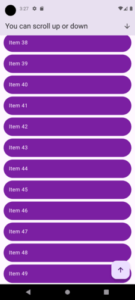
Let me explain to you step by step how I implemented the scroll controller of single child scroll view to scroll up and down using custom buttons.
1. Define scrollController and boolean value
I define a ScrollController named _scrollController. This controller is used to listen to and control the scrolling behavior of the SingleChildScrollView. I also define a boolean variable _showScrollToTopButton to manage the visibility of a floating action button (FAB) that will allow the user to scroll back to the top by clicking the button.
2. initState Method
The initState method is called when the widget is first created. Here, I’ve added a listener to _scrollController to monitor changes in the scroll position.
- Listening to Scroll Changes: When the user scrolls, the listener will print the current scroll position in the console so you(the developer) can see the data by yourself. It also checks if the user has scrolled down more than 100 pixels. If it has then it sets _showScrollToTopButton to true (showing the button). If the scroll position is less than 100 pixels, it hides the button by setting _showScrollToTopButton to false.
3. dispose Method
The dispose method is called/triggered when the widget is removed from the widget tree. This method is important in our case because it helps free up resources by disposing of the _scrollController when it’s no longer needed.
4. Scroll to Top and Bottom Functions
Two helper functions are defined to help the user scroll to the top or bottom of the list:
- _scrollToTop(): This function use the _scrollController.animateTo to smoothly scroll to the top (position 0) over duration of 1 second.
- _scrollToBottom(): This function also make use of _scrollController.animateTo, but it scrolls to the maximum scroll extent (the bottom of the list), again over 1 second.
5. Building the UI
The build method defines the user interface(UI) for this specific widget:
- Scaffold: It has the AppBar Widget, body, and a floating action button.
- AppBar: Here, I specified a title and an icon in its actions parameter. When the user taps this icon, it calls the _scrollToBottom function to scroll to the bottom of the list.
- SingleChildScrollView: It allows scrolling for its child widget. I’ve used the _scrollController to control this scroll view. The child is a Column that contains a list of items.
- Column with List Items: Inside the Column widget, I’ve used List.generate to create 50 items. Each item is a ListTile wrapped in Padding widget so it has some space. The tiles have a purple background with rounded corners and white text(using the text widget and its textstyle) which I’ve done using its parameters.
- Floating Action Button Visibility: If _showScrollToTopButton is true, then the floating action button will be shown. When clicked, it will call the _scrollToTop function to scroll back to the top. If _showScrollToTopButton is false, the FAB will hide or remain hidden if not shown already.
So in this way, we can specify custom buttons to scroll to the bottom or to the top using the controller parameter of Flutter singleChildScrollView.
Conclusion
Hope you now have a very well understanding of what the Flutter singleChildScrollView widget is and how you can use it in your app. You can play with its parameters to get your desired output. My recommendation is to use this widget in different scenarios so you can get used to its implementation with ease.
You can check out my other articles on Flutter app development for more information on other Flutter widgets and more. Thank you.

