Flutter Sliders | Single & RangeSlider (Code Examples)
In the Flutter Slider widget, you can select a single value from a specified range, whereas in the Range Slider widget, you can select both a start and end value within a specific range. We will cover the differences between the two types of sliders and explain their parameters, like value, min, max, divisions, label, etc., and how to use them with code examples.
You’ll also learn how to customize the working and design of these Flutter sliders for your app.
Outline
- Introduction to Flutter Sliders
- Types of Sliders in Flutter
- Syntax
- Slider Syntax
- Range Slider Syntax
- Code examples of Slider and Range Slider
- 1. Slider Widget Parameters Explained with Examples
- 1.1 value parameter
- 1.2 min parameter
- 1.3 max parameter
- 1.4 divisions parameter
- 1.5 label parameter
- 1.6 activeColor & inactiveColor parameter
- 2 Flutter RangeSlider Widget Parameters Explained with Examples
- 2.1 values, min, max, divisions, activeColor, inactiveColor, & onChanged Parameter
- 2.2 labels parameter
- Conclusion
Introduction to Flutter Sliders
In Flutter app development, sliders are interactive UI components through which users can select a value from a range by moving a thumb along a track. They are perfect for input where a continuous or discrete value is needed, like adjusting volume, brightness, price range, selecting a rating, etc.
Types of Sliders in Flutter
There are 2 types of them. These are:
Slider – Select a single value within a range.
RangeSlider – Select a start and end value within a range.
Flutter also gives support to other scrollable and interactive components like the Carousel Slider that you can use to scroll through images or cards.
Syntax
1. Slider Syntax
Slider(
        value: currentValue,
        min: 0.0,
        max: 100.0,
        divisions: 10,
        label: currentValue.toString(),
        onChanged: (newValue) {
          setState(() {
            currentValue = newValue;
          });
        },
      )
Explanation
valueThe current value of the slider.
Must be a
double.Must lie between
minandmax.
minThe minimum value of the slider.
Example:
0.0.
maxThe maximum value the slider can go to.
Example:
100.0.
divisions(optional)Divides the slider into fixed steps.
If not provided, the slider is smooth (continuous).
If provided, the slider has fixed stops (discrete).
label(optional)Displays a label (usually the value) above the thumb.
Works only if
divisionsis set.Helpful for user feedback.
onChangedA function that gets triggered whenever the slider is moved.
Provides the new value.
Usually, updates state using
setState.
2. Range Slider Syntax
RangeSlider(
  values: RangeValues(startValue, endValue),
  min: 0.0,
  max: 100.0,
  divisions: 10,
  labels: RangeLabels(startValue.toString(), endValue.toString()),
  onChanged: (RangeValues newValues) {
    setState(() {
      startValue = newValues.start;
      endValue = newValues.end;
    });
  },
)
Explanation
valuesHolds the currently selected range as a pair: start and end.
Uses RangeValues(start, end).
Both values must lie between
minandmax.
minThe minimum possible value of the range.
Example:
0.0.
maxThe maximum possible value of the range.
Example:
100.0.
divisions(optional)Divides the range slider into equal fixed steps.
Without it, the slider moves smoothly.
With it, the slider has snapping points.
labels(optional)Shows the current start and end values above each thumb.
Useful for feedback during user interaction.
Only visible if divisions are set.
onChangedA function is triggered when either thumb is moved.
Provides new RangeValues(start, end).
Typically used to update both values in
setState.
Code examples of Slider and Range Slider
1. Slider Widget Parameters Explained with Examples
1.1 value parameter
It represents the current position of the slider thumb. It takes a double (decimal) value.
class ValueSliderExample extends StatefulWidget {
  @override
  _ValueSliderExampleState createState() => _ValueSliderExampleState();
}

class _ValueSliderExampleState extends State<ValueSliderExample> {

  double _currentValue = 50.0;

  @override
  Widget build(BuildContext context) {
    return Scaffold(
      appBar: AppBar(title: Text('Slider - value Parameter')),
      body: Center(
        child: Column(
          mainAxisAlignment: MainAxisAlignment.center,
          children: [

            Slider(
              value: _currentValue,   // the value parameter
              min: 0.0,
              max: 100.0,
              onChanged: (double newValue) {
                setState(() {
                  _currentValue = newValue;
                });
              },
            ),
            Text('Current Value: ${_currentValue.toStringAsFixed(1)}'),
          ],
        ),
      ),
    );
  }
}
Explanation
By implementing this code, you will see a slider on your Flutter app’s screen. You can drag the thumb shown in the slider, and its position will be changed. Also, we displayed the value in text, so it’ll change accordingly. Let’s explain the code more.
Stateful Widget:
The widget is
Statefulbecause the slider’s value changes dynamically, and the UI needs to be updated.
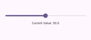
_currentValue:A
doublevariable that stores the current value of the slider, initialized to50.0.
Slider Widget:
value: _currentValue: Represents the current position of the slider’s thumb.min: 10.0: The slider’s minimum value, setting the leftmost position at10.0.max: 50.0: The slider’s maximum value, setting the rightmost position at50.0.onChanged: A callback that updates the slider’s value whenever the user changes it, usingsetStateto refresh the UI.
Text Widget:
The Flutter text displays the current value of the slider, formatted to one decimal place (
_currentValue.toStringAsFixed(1)).
Dynamic Interaction:
The slider’s thumb moves between
10.0and50.0, and the displayed value updates as the user changes the slider.
setState:The Flutter setState is used to trigger a UI update whenever the value changes, ensuring the slider and text widget reflect the new value.
1.2 min parameter
min:10.0
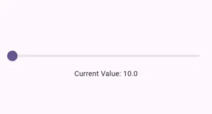
The min parameter defines the lowest value the slider can have. It takes a double value. In this example, it’s set to 10.0. The slider will not go below this value.
1.3 max parameter
max: 500.0

1.4 divisions parameter
divisions: 5
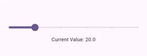
The divisions parameter splits the slider into discrete intervals. It takes an integer value. In this example, it divides the range from 0 to 100 into 5 intervals, so the slider will only stop at values like 0, 20, 40, 60, 80, and 100. You can see points in the slider in the above image.
1.5 label parameter
label: _currentValue.round().toString()
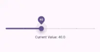
The label parameter is used to display a dynamic label above the slider’s thumb. It accepts a string value, and you can pass it a variable that changes as the slider moves. In this example, we pass the current value of the slider, which is a double. To display it as a string, we use the round() method to round the value to the nearest whole number, then convert it to a string for display.
The label is particularly useful when the slider has divisions, as it allows you to provide meaningful, readable values at each step of the slider. This enhances the user experience by making it clear what the current value represents in a more intuitive way.
1.6 activeColor & inactiveColor parameter
activeColor: Colors.blue,
inactiveColor: Colors.grey

Explanation
activeColor: It takes a color value and sets the color for the portion of the slider that has been selected or moved towards by the thumb.
inactiveColor: It also takes a color value that sets the color for the unselected portion of the slider’s track.
In this example:
The active portion is colored blue (
Colors.blue).The inactive portion is colored gray (
Colors.grey).
These colors provide a clear visual distinction between the selected and unselected parts of the slider.
2. Flutter RangeSlider Widget Parameters Explained with Examples
2.1 values, min, max, divisions, activeColor, inactiveColor, & onChanged Parameter
class RangeSliderExample extends StatefulWidget {
@override
_RangeSliderExampleState createState() => _RangeSliderExampleState();
}
class _RangeSliderExampleState extends State<RangeSliderExample> {
RangeValues _currentRange = RangeValues(20, 80);
@override
Widget build(BuildContext context) {
return Scaffold(
appBar: AppBar(title: Text('RangeSlider - Parameters Example')),
body: Center(
child: Column(
mainAxisAlignment: MainAxisAlignment.center,
children: [
RangeSlider(
values: _currentRange,
min: 0.0,
max: 100.0,
activeColor: Colors.blue,
inactiveColor: Colors.grey,
divisions: 5, // Dividing the slider into 5 steps
onChanged: (RangeValues newValues) {
setState(() {
_currentRange = newValues; // Updating the range values
});
},
),
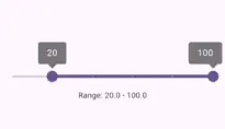
Text('Range: ${_currentRange.start} - ${_currentRange.end}'),
],
),
),
);
}
}
Explanation
This code will show a range slider. You can drag the start thumb or end thumb to adjust the range. Here, we used a simple design using Flutter appbar, column, range slider, and text widget.
- values: The values parameter in the RangeSlider holds the current range, which has a start and an end value inside a RangeValues object. Users can pick a range by moving two thumbs on the slider. Both values must be between the min and max values set for the slider. As the user changes the position of the thumbs, the values update automatically. The values parameter is important for keeping track of and updating the selected range.
RangeSlider: It allows users to select a range of values with two thumbs (start and end). The slider’s range is between
min: 0.0andmax: 100.0.Divisions: The slider is divided into 5 discrete steps using divisions: 5, limiting the selectable values to 0, 20, 40, 60, 80, and 100.
- activeColor & inactiveColor: The active specifies the path area which is active and shown in blue in the above image. While the inactive shows the area that is not active, and a grey color is assigned to it.
onChanged: This callback updates the slider values whenever the user moves either thumb. The values are stored in
_currentRange, which is updated usingsetStateto trigger a UI refresh.Text Widget: Displays the current range selected by the user, showing the
startandendvalues from theRangeValues.
2.2 labels parameter
 labels: RangeLabels(
   '${_currentRange.start.round()}',
   '${_currentRange.end.round()}',
)
Explanation
- In this example, the label parameter in the RangeSlider is used to display dynamic text above each thumb (start and end) of the slider.
- The RangeLabels constructor takes two values, the start and end values, which are rounded and displayed as labels. This gives users a real-time visual indication of the selected range.
- The label parameter works alongside the divisions parameter to provide clearer feedback for selected range values.
- ‘${_currentRange.start.round()}‘ and ‘${_currentRange.end.round()}‘ round the start and end values of the range to integers and convert them into strings to display labels above the respective thumbs.
Conclusion
So we practically learnt what Flutter Slider and RangeSlider widgets are and explained their parameters like value, min, max, label, etc, with code examples. The Slider allows users to select a single value from a range, while the RangeSlider enables users to pick both a start and end value.
We customized both these widgets, so it’s easy for you to change them according to your project. In case you still have any questions or suggestions, then email us. We’d be happy to help.