How to use Flutter Stack Widget
Want to make Flutter widgets on top of each other to make the design eye-catching and position them accordingly? Then Flutter stack widget is available to solve your problem.
By using this widget, you can easily put as many widgets as you want on top of each other. Let’s practically understand how to use stack in Flutter.
The parameters of this stack widget will be discussed with code examples and proper explanations for easy understanding.
About Flutter Stack Widget
Different complex layouts in the Flutter app are made possible with this widget. It takes multiple Flutter widgets as its children and puts them on top of each other. You can modify the position of each child as well which allows you to make the design super creative.
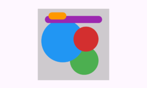
It’s a simple demonstration of what stack with positioned widget can do.
Let’s start with its basic syntax, and then understand its parameters with code examples.
Syntax
Stack(
   children: []
     )
- I first created an instance of stack class using Stack().
- The parameter ‘children’ takes a list of widgets that will be shown in the stack.
Parameters
- children
- alignment
- fit
- textDirection
Examples to explain stack in Flutter
Example 1: ‘children’ parameter
Stack(
    children: [
        Container(height: 33, width: 60, color: Colors.blue),
        Container(height: 20, width: 40, color: Colors.red),
          ],
        )

- This children parameter accepts only a list of Flutter widgets. For demonstration, I just passed it two Flutter container widgets with different colors and sizes for good visibility. The first child is a bit bigger than the second one.
- The above image shows 2 containers that are on top of each other. Also, you can see that the second item is at the top, while the first one is at the bottom.
- The stack is order sensitive, the lower you put the items in the list, the higher it’ll show in the stack. For instance, the last item will show at top, the item before it in the list will show below this item in stack, and so on.
Example 2: ‘alignment’ parameter
alignment: AlignmentDirectional.topStart

- This parameter has a type ‘AlignmentGeometry‘. It actually specifies the alignment of non-positioned items. In the above code, the default alignment is shown which is top start or you can say start for cases of languages(right to left).
- The above image shows that both the containers are in top start position which is actually more visible in the second item because of its small size. I’ve wrapped this stack inside the Center widget so its shown in the screen’s center.
- Keep in mind that here I didn’t give any size to the stack parent as I just wrapped it with center, so its size is by default, the size of its biggest child.
- This alignment works for the items that are not wrapped with positioned widget. We’ll understand this widget later in this article.
Example 2.1: Alignment.center
alignment: Alignment.center

Example 2.2: Alignment.bottomLeft
alignment: Alignment.bottomLeft

- Alignment.centerLeft
- Alignment.centerRight
- Alignment.bottomRight
- Alignment.topLeft
- Alignment.topRight
- Alignment.bottomCenter
- Alignment.topCenter
Example 3: ‘fit’ parameter
fit: StackFit.loose
The fit parameter is used to size the non-positioned items of stack. The default is StackFit.loose which means that the stack will only take up the size up to its biggest child as we’ve discussed in example 2.
Let’s discuss the different stack fit properties with code examples.
Example 3.1: StackFit.loose
Center(
          child: Container(
        width: 200,
        height: 200,
        color: Colors.grey,
        child: Stack(
          fit: StackFit.loose, // Stack is only as big as its biggest child
          children: <Widget>[
            Container(
              width: 90,
              height: 90,
              color: Colors.red,
            ),
            Container(
              width: 50,
              height: 50,
              color: Colors.blue,
            ),
          ],
        ),
      ))
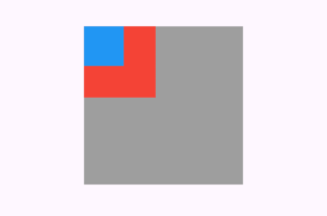
For detailed explanation, I created a grey-colored container and gave it a stack widget as child.
In the stack, there are 2 containers and here you can see that the size of stack only adapts to the size of its biggest child, which in our case is the red container.
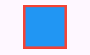
Example 3.2: StackFit.expand
fit: StackFit.expand
Example 3.3: StackFit.passthrough
fit: StackFit.passthrough
Example 4: Positioned Widget
Positioned(
   child:  //child widget will be passed herehere
)
This widget is used to set the position of the widget passed to its child parameter. Its parameters are listed below:
- top
- bottom
- left
- right
- height
- width
These parameters takes a double(decimal value) but if you pass integer value to it then it will work too.
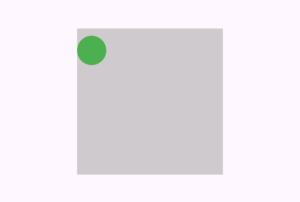
Example 4.1: top
Positioned(
          top: 10,
          child: CircleAvatar(
                  backgroundColor: Colors.green,
                ))
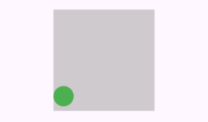
Example 4.2: bottom
bottom: 9
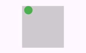
Example 4.3: left
left: 10
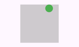
Example 4.4: right
right: 30
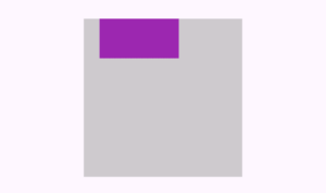
Example 4.5: height and width parameter
height: 50
width: 100
Example 5: textDirection Parameter
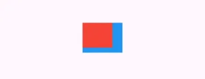
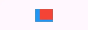
This parameter is used to tell the Stack widget whether to arrange its items from left to right direction (like in English) or from right to left (like in Arabic or Hebrew). This is an important feature when you are creating Flutter apps that support different languages.
It works superbly when you also use ‘AlignmentDirectional’ or ‘PositionedDirectional’ because those align widgets depend on the text direction.
- ltr (Left to Right): For languages such as English.
- rtl (Right to Left): For languages such as Arabic or Hebrew.
Example 5.1: ltr (Left to Right)
Stack(
      textDirection: TextDirection.ltr, // Items from left to right
      children: [
        Container(height: 60, width: 80, color: Colors.blue),
        Container(height: 50, width: 60, color: Colors.red),
          ],
        )
Example 5.2: rtl (Right to Left)
textDirection: TextDirection.rtl
Conclusion
The proper implementation of the Flutter stack widget is discussed using very easy code examples and I’ve explained them so you can easily understand it.
By using this knowledge, I want you to make the same design that I’ve displayed in the ‘About Flutter Stack Widget’ section.
Feel free to comment or email me if you find any issues with stack widget. I’ll be very happy to help you.
I recommend you to read my other posts on other important Flutter widgets as well to strengthen your expertise in Flutter app design. Thank you.

