Flutter Wrap Widget Explained with Code Examples 2025
What is the Flutter Wrap Widget?
In Flutter, the Wrap widget automatically arranges its children, like Flutter cards, icon buttons, etc., either horizontally or vertically and wraps them when there’s no more space in the current row or column. It’s super useful for creating layouts that need to be responsive, like tag clouds, grids, or lists that should adjust to the available space.
Unlike Row and Column, which are fixed to one direction, Wrap adapts its layout. When the space in the main direction is filled, it simply moves to the next line or column and continues placing items. This makes it perfect for flexible and dynamic layouts.
Syntax of the Wrap Widget
Wrap(
  direction: Axis.horizontal, // Direction to arrange the children
  alignment: WrapAlignment.start, // Align children along the main axis
  spacing: 8.0, // Horizontal space between children
  runSpacing: 4.0, // Vertical space between wrapped lines
  children: <Widget>[
    // You can add child widgets here
  ],
)
Explanation of Parameters
direction: Defines the main axis direction, either Axis.horizontal or Axis.vertical.
alignment: Controls how children are aligned along the main axis.
spacing: Sets the space between children along the main axis.
runSpacing: Determines the vertical space between lines when the items wrap.
children: A list of Flutter widgets to be wrapped.
Code Examples to Explain Parameters of Flutter Wrap Widget
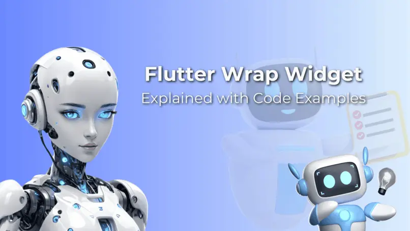
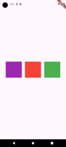
Example 1: children parameter
Scaffold(
    body: Center(
      child: Wrap(
        children: <Widget>[
          Container(color: Colors.red, height: 50, width: 50),
          Container(color: Colors.blue, height: 50, width: 50),
          Container(color: Colors.green, height: 50, width: 50),
        ],
      ),
    ),
    )
This parameter takes and holds the list of Flutter widgets that will be arranged inside the Wrap widget. These are the child widgets that will be placed based on the direction and alignment you define. The child widgets can be of any type, such as Flutter gridview, text widget, etc.
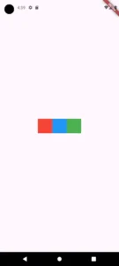
Example 2: direction parameter
direction: Axis.horizontal, // Arranges items horizontally
direction: Axis.vertical
The direction parameter in the Wrap widget defines how its children are arranged. It can take two values from the Axis enum:
Axis.horizontal: This arranges the children in a horizontal row.
Axis.vertical: This arranges the children in a vertical column.
When the available space in the current direction runs out, the Wrap widget automatically moves the children to the next row or column. Essentially, it controls how the child widgets flow within the Wrap.
We passed Flutter container widgets to the wrap’s children parameter to see the UI changes properly.
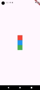
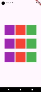
Example 3: alignment Parameter
Wrap(
          alignment: WrapAlignment.center, // Centers the items horizontally
          children: <Widget>[
            Container(color: Colors.purple, height: 100, width: 100),
            Container(color: Colors.red, height: 100, width: 100),
            Container(color: Colors.green, height: 100, width: 100),
          ],
        )
The alignment parameter in the Wrap widget controls how the children are positioned along the main axis (whether horizontally or vertically, depending on the direction).
WrapAlignment.start: Aligns the children at the beginning of the axis.
WrapAlignment.end: Aligns the children at the end of the axis.
WrapAlignment.center: It centers the children along the axis.
WrapAlignment.spaceBetween: Distributes space evenly between the children.
WrapAlignment.spaceAround: Adds equal space around each child.
Example 4: spacing Parameter
spacing: 20.0 // Adds 20 pixels of space between the items horizontally
Example 5: runSpacing Parameter
runSpacing: 35.0
The runSpacing parameter of wrap widget controls the vertical space between the rows when the child widgets wrap. While spacing defines the horizontal gap between the items, runSpacing adds space between the lines (rows) of wrapped children.
In this example, we give 35.0 to runSpacing which adds 35 pixels of vertical space between rows of items. We put 9 containers so the vertical spacing can be seen more clearly.
Example 6: crossAxisAlignment Parameter
crossAxisAlignment: WrapCrossAlignment.end, // Centers children along the cross axis
This parameter in the Wrap widget controls how the children are aligned along the cross axis, which is perpendicular to the main axis. So, if the main axis is horizontal (using Axis.horizontal), the cross axis becomes vertical, and vice versa.
This parameter accepts values from the WrapCrossAlignment enum:
WrapCrossAlignment.start: Aligns the children at the start of the cross axis.
WrapCrossAlignment.end: Aligns the children at the end of the cross axis.
WrapCrossAlignment.center: Centers the children along the cross axis.
WrapCrossAlignment.stretch: Stretches the children to fill the cross axis.
For example, if you set crossAxisAlignment: WrapCrossAlignment.center, the items will be centered along the vertical axis when the direction is set to Axis.horizontal.
Example 7: textDirection parameter

textDirection: TextDirection.rtl

The textDirection parameter controls how the children are laid out, either left-to-right (LTR) or right-to-left (RTL). This affects how both text and widgets are positioned.
TextDirection.ltr: Arranges the children from left to right. This is the default direction, commonly used for languages like English.
TextDirection.rtl: Arranges the children from right to left, which is typical for languages like Arabic or Hebrew.
For example, setting textDirection: TextDirection.ltr ensures that the children are displayed from left to right. On the other hand, the TextDirection.rtl arranges them from right to left.
Conclusion
Here, we have learnt what the Flutter wrap widget does and how to use it with simple code examples. We also explained its key parameters with practical Flutter code examples so you know when and how to use them in your own app.
If you have any questions or ideas, feel free to contact us because we’re always ready to help. And don’t forget to check out our other articles to learn about other amazing Flutter widgets and more.